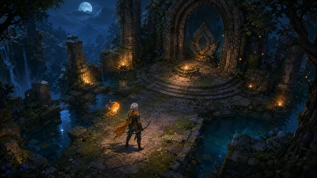
AI 이미지로 게임 에셋을 만든다는 말은 한 줄 프롬프트로 완성 게임 그래픽을 뽑는다는 뜻이 아닙니다. 가장 안정적인 방식은 AI를 아이디어 탐색과 시각적 초안 제작 도구로 사용하고, 사람이 규격·일관성·알파·애니메이션·충돌·권리를 최종 책임지는 것입니다.
이 가이드에서는 하나의 오리지널 2D 액션 RPG 세계를 예로 들어 아트 디렉션 보드, 캐릭터 시트, 인벤토리 아이콘, 모듈형 환경 타일을 순서대로 만듭니다. 각 이미지 아래에는 실제 제작 프롬프트를 제공하며, 마지막에는 Unity, Unreal Engine과 Godot로 옮기기 전 확인할 항목을 정리합니다.
이 글은 2026년 7월 28일 확인한 Unity 6, Unreal Engine 5.8, Godot 4.x, Steamworks와 미국 저작권청 공식 자료를 기준으로 합니다. 모델 약관과 엔진 UI는 바뀔 수 있으므로 제작·배포 시 최신 정책을 다시 확인하세요. 아래 내용은 법률 자문이 아닙니다.
1. 먼저 게임 규격을 정하고 이미지를 만든다
AI에게 바로 “멋진 게임 에셋”을 요청하면 카메라, 비율, 광원과 세부 밀도가 이미지마다 달라집니다. 생성 전에 다음 다섯 가지를 한 장의 제작 명세로 고정하세요.
| 결정 항목 | 예시 | 실패를 줄이는 이유 |
|---|---|---|
| 게임 시점 | 탑다운 3/4 시점 | 캐릭터와 타일의 투시를 맞춘다 |
| 기준 크기 | 캐릭터 높이 128px, 타일 64px | 화면 안 정보량과 충돌 크기를 예측한다 |
| 색 규칙 | 청록·남색 그림자, 호박색 강조 | 결과가 달라도 같은 세계처럼 보이게 한다 |
| 재질 규칙 | 거친 석재, 낡은 가죽, 무광 금속 | 프롬프트의 형용사를 재사용할 수 있다 |
| 출력 역할 | 콘셉트, 시트, 아이콘, 타일 | 한 이미지가 여러 책임을 섞지 않게 한다 |
Unity의 공식 Sprite Import Settings는 한 장을 단일 Sprite로 쓸지, 여러 포즈·타일이 든 시트를 Multiple로 분리할지 구분하고 Pixels Per Unit으로 월드 단위와 픽셀의 관계를 정합니다. 즉, 프롬프트보다 먼저 “엔진에서 어떻게 잘라 쓸 것인가”를 정해야 합니다.
2. 아트 디렉션 보드로 시각 언어를 잠근다
첫 결과물은 포스터가 아니라 팀이 반복해서 참고할 시각 계약서입니다. 주인공의 실루엣, 핵심 소품, 5~7개의 색, 표면 질감과 대표 조명을 한 보드에 모읍니다. 이 보드는 이후 모든 생성에서 참조 이미지 1번으로 사용합니다.
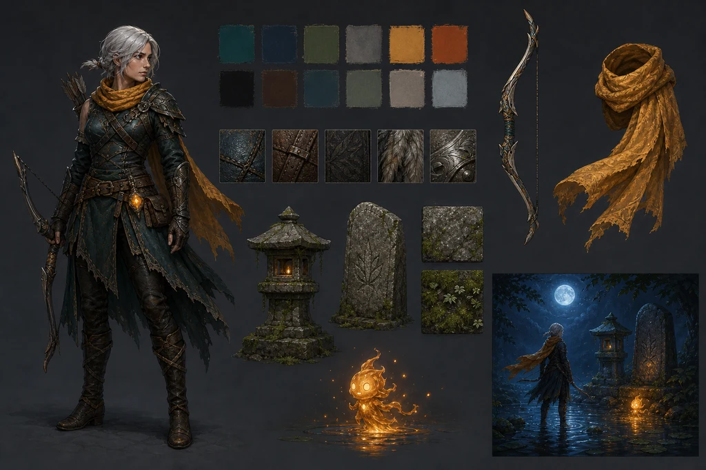
이미지 제작 프롬프트
Use case: stylized-concept
Asset type: game art-direction style bible board, landscape
Primary request: Design a clean visual style bible for the same original moonlit action-RPG world: an adult female ranger with a short silver braid, saffron scarf, dark teal leather armor and ashwood bow; a tiny amber ember spirit; mossy shrine stone; shallow water; blue moonlight; warm embers. Show one full character silhouette, small material swatches, color chips represented only as unlabelled painted squares, bow and scarf callouts, stone and moss samples, and a compact lighting vignette.
Style/medium: premium hand-painted 2D game concept art, stylized realism, coherent production design
Composition/framing: organized landscape concept board with generous spacing and a clear visual hierarchy; each element isolated and fully visible
Lighting/mood: neutral presentation lighting on assets, with one cool-blue versus amber lighting vignette
Color palette: deep teal, indigo, moss green, saffron, ember orange, weathered gray stone
Constraints: exactly one full adult ranger depiction plus small non-character callouts; maintain the defined costume and proportions; no text, no letters, no numbers, no logos, no watermark, no recognizable franchise, no decorative typography, no extra people
좋은 보드는 설명이 많아서가 아니라 선택이 적어서 강합니다. 이번 예제는 짙은 청록, 남색, 이끼색, 사프란과 호박색만 주요 색으로 사용하고, 금속도 번쩍이는 크롬 대신 낡은 은색으로 제한했습니다. 특정 작가나 상용 게임의 화풍을 복제하기보다 재질, 대비, 붓질 밀도와 카메라 같은 관찰 가능한 속성을 적는 편이 안전하고 재사용하기 쉽습니다.
3. 캐릭터 시트는 동일 인물을 여러 번 그리는 시험이다
캐릭터 이미지는 한 장의 얼굴이 예쁜 것보다 정면·측면·후면에서 장비 구조가 이어지는지가 중요합니다. 전신을 자르지 않고, 중립광과 단순 배경을 사용하며, 액션 포즈는 턴어라운드와 분리해 배치합니다.
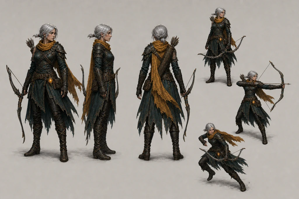
이미지 제작 프롬프트
Use case: stylized-concept
Asset type: production game character turnaround and action-pose sheet
Input images: Image 1 is the approved style and identity reference; preserve the adult female ranger's short silver braid, facial structure, saffron scarf, dark teal layered leather armor, boots, quiver, and ashwood bow.
Primary request: Create a clean character production sheet for that same original adult ranger. Show three full-body orthographic turnarounds—front, side, back—plus three smaller gameplay poses: idle with bow lowered, drawing an arrow, and a short evasive step. Keep costume construction and body proportions identical in every view.
Scene/backdrop: plain warm light-gray studio board with subtle grounding only
Style/medium: hand-painted 2D game character concept art, stylized realism, crisp readable silhouette, production reference quality
Composition/framing: landscape sheet, evenly spaced figures, every body and weapon fully visible, no overlapping crops
Lighting/mood: neutral diffuse studio lighting; no dramatic environment lighting
Color palette: same deep teal, worn leather brown, saffron and muted steel from the reference
Constraints: one adult character identity repeated as design views, not multiple distinct people; consistent face, hairstyle, costume, bow size and proportions; no text, no labels, no arrows, no logos, no watermark, no environment, no extra characters, no distorted hands or duplicated weapons
생성 후에는 얼굴, 머리 길이, 어깨 장식, 벨트 수, 활의 길이와 화살통 위치를 확대해 비교하세요. 불일치가 있으면 시트 전체를 다시 만드는 것보다 승인한 정면 이미지를 기준으로 측면과 후면만 한 번에 하나씩 수정하는 방식이 안정적입니다. 실제 애니메이션 프레임은 이 시트를 참고해 별도의 균일 그리드로 제작하고, 발바닥 기준선과 피벗 위치를 고정합니다.
4. 인벤토리 아이콘은 멋보다 판독성과 그리드가 먼저다
아이콘은 작은 화면에서 1초 안에 구분되어야 합니다. 모든 물체의 카메라 각도, 광원 방향, 외곽 여백과 배경 밝기를 맞추고, 한 칸에는 한 물체만 넣습니다. 생성 단계에서 글자를 넣지 말고 이름과 수치는 게임 UI에서 렌더링하는 편이 수정과 현지화에 유리합니다.
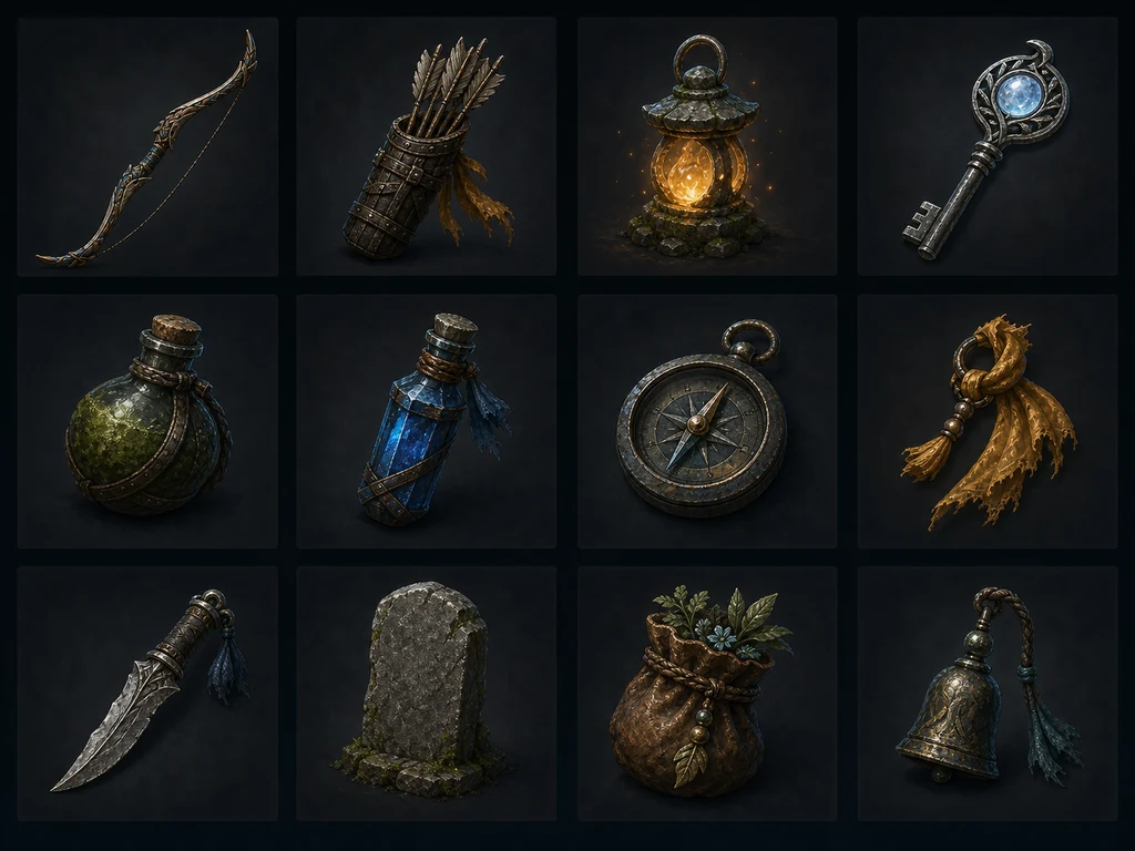
이미지 제작 프롬프트
Use case: stylized-concept
Asset type: production-ready game inventory icon and prop sheet
Input images: use the approved art-direction and character references only for material, color, scale, and bow design; do not include the character.
Primary request: Create a precise 4 by 3 grid of twelve original inventory assets for the same moonlit shrine action-RPG: ashwood bow, bundled arrows, amber spirit lantern, moonstone key, moss-covered health flask, blue mana vial, weathered field compass, saffron cloth charm, silver leaf dagger, rune-free stone tablet, leather herb pouch, and a small shrine bell. Each object must appear exactly once.
Scene/backdrop: twelve separate dark neutral square cells with consistent margins and no decorative scenery
Style/medium: hand-painted 2D game inventory icons, stylized realism, production-ready silhouettes, consistent three-quarter view, controlled material highlights
Composition/framing: exact 4 columns by 3 rows, one centered item per cell, generous padding, no overlap, identical visual scale where practical
Lighting/mood: cool rim light with a restrained warm amber key light, consistent across all cells
Color palette: deep teal, weathered brown, moss green, saffron, silver, amber, moonlit blue
Constraints: exactly twelve distinct items and no duplicates; no people, no hands, no creatures, no text, no labels, no numbers, no runes that resemble writing, no logos, no watermark, no border ornaments, no recognizable franchise| 검수 항목 | 통과 기준 |
|---|---|
| 중복 | 요청한 물체가 정확히 한 번씩 나온다 |
| 실루엣 | 64px에서도 활, 열쇠, 물약이 구분된다 |
| 여백 | 모든 칸의 시각적 크기와 패딩이 비슷하다 |
| 광원 | 하이라이트와 그림자 방향이 일관된다 |
| 알파 | 테두리의 검은 띠, 흰 프린지와 반투명 노이즈가 없다 |
최종 아이콘은 셀별로 잘라 투명 PNG나 엔진이 요구하는 포맷으로 보관하세요. WebP는 웹 미리보기에는 효율적이지만 실제 게임 소스 포맷은 대상 엔진, 플랫폼과 빌드 파이프라인 기준으로 선택해야 합니다.
5. 환경 타일은 ‘예쁜 장면’이 아니라 연결 규칙이다
타일 프롬프트에는 완성된 던전 장면 대신 바닥 기본형·변형, 물 가장자리의 직선·안쪽 모서리·바깥 모서리, 벽, 계단과 독립 소품을 요구합니다. 투시, 타일 발자국, 텍셀 밀도와 가장자리 높이가 같아야 실제 맵으로 조립할 수 있습니다.
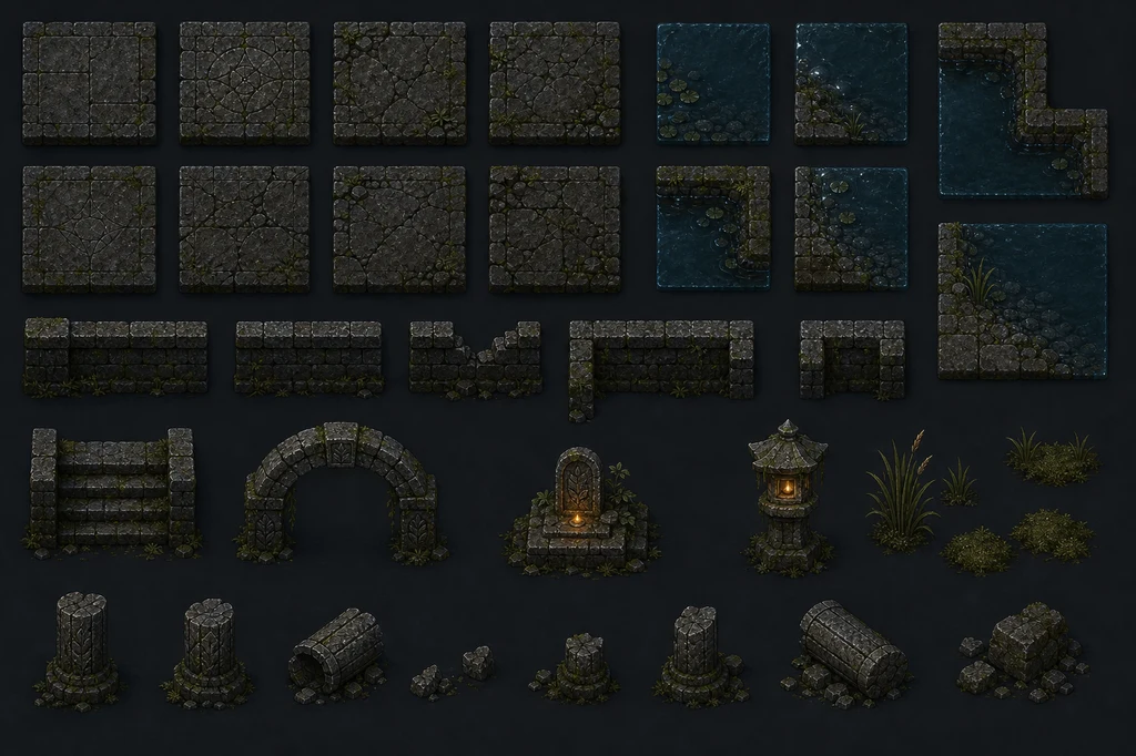
이미지 제작 프롬프트
Use case: stylized-concept
Asset type: modular top-down game environment tileset and prop kit
Input images: use the approved game art references only for the moonlit shrine world's palette, mossy stone, water, amber lighting and material finish; do not include the ranger.
Primary request: Create a production concept sheet of modular environment pieces for the same original 2D action-RPG. Include square mossy floor tiles, cracked floor variants, shallow-water edge and corner tiles, straight and broken stone walls, a stair segment, one arch segment, a low altar, a stone lantern, small reeds, moss clusters, and broken-column props. Every module must be visually compatible and capable of assembling into the shrine environment.
Scene/backdrop: clean neutral charcoal presentation board
Style/medium: hand-painted 2D game tiles and modular props, stylized realism, consistent top-down three-quarter camera and texel density
Composition/framing: organized landscape sheet with a strict modular grid, generous gaps between pieces, each module fully visible, orthographic-like presentation, no completed scene
Lighting/mood: neutral cool moonlight with restrained amber emissive accents only on lantern and altar
Color palette: weathered gray stone, deep teal water, moss green, indigo shadow, amber glow
Constraints: consistent tile footprint, perspective, edge alignment, scale and material language; no characters, no creatures, no text, no labels, no numbers, no logos, no watermark, no recognizable franchise, no decorative border, no overlapping pieces
AI가 만든 시트는 연결 가능한 것처럼 보여도 가장자리 픽셀이 실제로 맞지 않을 수 있습니다. 이미지 편집기에서 셀 크기를 통일하고, 좌우·상하 반복 미리보기로 틈을 검사하며, 물가 코너 조합을 직접 테스트하세요. 장식용 소품과 충돌 가능한 구조물도 레이어와 파일을 분리하는 편이 좋습니다.
Unreal의 현재 텍스처 문서는 가능한 경우 power-of-two 크기를 권장하며, 이러한 텍스처가 mipmap과 스트리밍에 적합하다고 설명합니다. Paper 2D에서는 스프라이트 시트를 개별 Sprite로 추출하고 TileSet으로 환경을 구성할 수 있습니다. Godot은 일반 2D와 픽셀 아트에 무손실 압축을 권장하고, 낮은 해상도의 픽셀 아트에는 VRAM 압축이 외관을 해칠 수 있다고 안내합니다.
6. 엔진에 넣기 전 반드시 사람이 마감한다
| 단계 | 사람이 할 작업 | 자동 생성만 믿으면 생기는 문제 |
|---|---|---|
| 정리 | 배경 제거, 프린지 제거, 외곽선 보정 | 검은 테두리와 떠 있는 픽셀 |
| 규격화 | 캔버스, PPU, 피벗, 그리드 통일 | 캐릭터 크기와 발 위치가 흔들림 |
| 애니메이션 | 프레임 간 몸통·장비 부피 고정 | 활과 손이 증식하거나 사라짐 |
| 타일 | 모든 모서리 조합과 반복 테스트 | 맵에 선과 틈이 생김 |
| 최적화 | 아틀라스, 압축, mipmap, 메모리 확인 | 품질 저하 또는 빌드 용량 증가 |
| 게임성 | 충돌, 히트박스, 판독성 검증 | 이미지와 실제 플레이가 불일치 |
Unity에서는 Texture Type을 Sprite로 설정하고 단일 이미지면 Single, 시트면 Multiple을 선택한 뒤 동일한 Pixels Per Unit을 적용합니다. Unreal Paper 2D는 PNG와 알파를 준비해 Sprite Sheet에서 프레임을 추출할 수 있으며, 피벗과 충돌은 Sprite Editor에서 조정합니다. Godot에서는 2D 에셋의 압축 모드와 필터·반복 설정을 픽셀 스타일에 맞게 확인합니다.
7. 대표 썸네일은 에셋이 실제로 조립된 모습을 보여준다
개별 시트만 보면 스케일과 색이 어울리는지 판단하기 어렵습니다. 마지막에는 캐릭터, 타일, 소품과 조명이 하나의 플레이 장면에서 같은 시점과 대비를 유지하는지 확인합니다. 아래 프롬프트는 이 글의 대표 이미지를 만들 때 사용했습니다.
대표 썸네일 제작 프롬프트
Use case: stylized-concept
Asset type: 16:9 blog thumbnail and finished 2D action-RPG gameplay key art
Primary request: Create an original polished game scene for a fictional project called only conceptually Emberfall; do not render any title or words. An adult female ranger with a short silver braid, a saffron scarf, dark teal leather armor, and an ashwood bow stands in a moonlit ruined shrine while a small amber ember spirit floats beside her. Mossy stone tiles, broken arches, shallow water, blue moonlight and warm magical embers establish a coherent production-ready art direction.
Style/medium: premium hand-painted 2D game art with stylized realism, readable top-down three-quarter gameplay camera, crisp silhouettes, restrained painterly texture, believable game-environment scale
Composition/framing: wide 16:9 landscape, player character near lower center, a ruined altar as the focal point, navigable floor shapes and foreground-to-background depth; no cinematic letterbox
Lighting/mood: cool indigo moonlight contrasted with warm amber particles, mysterious but inviting
Color palette: deep teal, moonlit blue, moss green, saffron, ember orange
Constraints: original characters and setting; exactly one adult ranger and one small ember spirit; consistent proportions; no text, no logos, no watermark, no recognizable franchise, no photorealism, no UI labels, no gibberish glyphs
이 장면은 최종 게임 스크린샷이 아니라 조립 목표를 보여주는 키 아트입니다. 실제 플레이 화면에서는 이동 가능한 바닥, 적과 투사체, 상호작용 오브젝트가 배경 장식보다 더 선명해야 합니다. 썸네일의 영화적 조명을 그대로 게임에 옮기기보다 플레이 테스트에서 판독성을 다시 조정하세요.
8. 권리와 배포 기록도 에셋의 일부다
모델 이름, 사용일, 약관 URL, 입력 참조의 출처, 프롬프트, 생성 원본, 사람의 수정 파일과 승인자를 함께 기록하세요. Steamworks의 공식 Content Survey는 게임에 포함되어 플레이어가 소비하는 AI 보조 제작물에 대해 Pre-Generated AI 콘텐츠로 설명하도록 요구합니다. 라이브 생성 기능은 불법 콘텐츠를 막는 가드레일까지 설명해야 합니다.
미국 저작권청의 2025년 보고서는 순수 AI 결과가 아니라 인간이 충분한 표현 요소를 결정한 경우에 보호 가능성이 있으며, 프롬프트만 제공한 것은 그 자체로 충분하지 않다고 정리했습니다. 국가별 법은 다르지만, 사람이 선택·배열·수정하고 그 과정을 보존해야 할 실무적 이유는 분명합니다.
출시 전 체크리스트
- 사용한 모델의 상업적 이용 조건과 출력물 정책을 최신 약관에서 확인했는가
- 타인의 캐릭터, 로고, UI, 상표와 식별 가능한 화풍을 의도적으로 복제하지 않았는가
- 입력 이미지·폰트·브러시·텍스처의 라이선스를 증명할 수 있는가
- 원본 생성물과 사람이 수정한 최종 파일을 버전별로 보관했는가
- 플랫폼의 AI 콘텐츠 공개 항목을 정확히 작성했는가
- 실제 기기에서 판독성, 메모리, 압축과 프레임 성능을 확인했는가
결론: AI는 에셋 공장이 아니라 빠른 아트 협업자다
AI 이미지 생성의 가장 큰 장점은 많은 방향을 빠르게 보고, 승인된 시각 규칙을 캐릭터·소품·환경으로 확장하는 데 있습니다. 하지만 게임 에셋의 품질은 프롬프트가 아니라 규격을 먼저 정하고, 역할별로 생성하고, 엔진에서 검증하고, 사람이 수정한 기록을 남기는 과정에서 결정됩니다.