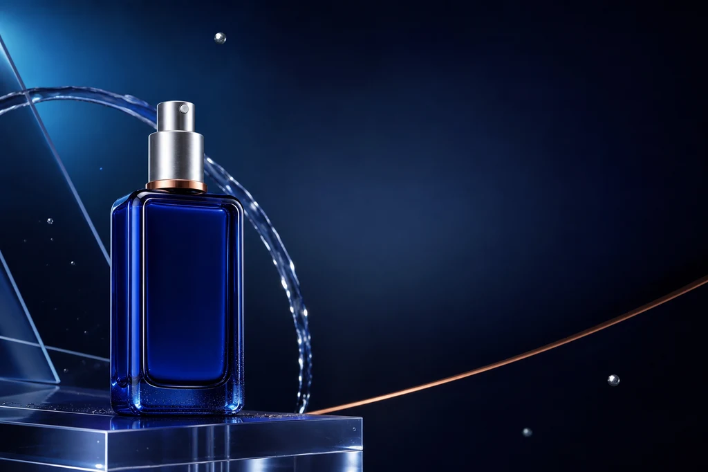
AI로 광고 전단지를 만들 때 가장 흔한 실패는 배경이 촌스러운 것이 아니라 상품 자체가 달라지는 것입니다. 병의 비율, 캡, 라벨, 색과 재질이 바뀌면 예쁜 이미지라도 실제 상품 광고로 사용할 수 없습니다. 반대로 모든 문구까지 이미지 모델에 한 번에 맡기면 가격·용량·법적 고지에 오탈자가 생길 수 있습니다.
이 가이드는 상품 참조를 고정한 뒤 배경과 구도를 만들고, 정확성이 필요한 텍스트는 Canva·Adobe Express·Figma 같은 편집 도구에서 별도 레이어로 올리는 실무 흐름을 제안합니다. OpenAI는 이미지 입력을 활용한 반복 편집을 지원하고, Google의 제품 커스터마이징 문서는 참조 상품을 다른 장면과 각도에 배치하는 용도를 안내합니다. Adobe Firefly는 구성 참조와 스타일 참조를 분리해 배치와 분위기를 각각 제어할 수 있습니다.
전체 제작 흐름
| 단계 | 핵심 산출물 | AI에 맡길 일 | 사람이 확인할 일 |
|---|---|---|---|
| 1. 상품 기준 | 깨끗한 제품 컷 | 배경 정리·광원 보정 | 형태·라벨·색상 일치 |
| 2. 메시지 설계 | 헤드라인·혜택·CTA | 카피 초안 보조 | 사실·가격·표현 승인 |
| 3. 광고 장면 | 합성 배경 이미지 | 환경·광원·재질 생성 | 상품 윤곽과 그림자 |
| 4. 레이아웃 | 3개 구도 후보 | 시선 흐름·여백 탐색 | 우선순위와 가독성 |
| 5. 조판·출력 | 최종 전단지 | 필요 시 부분 수정 | 정확한 텍스트·인쇄 규격 |
예시 상품은 특정 브랜드를 모방하지 않은 코발트 블루 유리 세럼 병입니다. 실제 작업에서는 상품 사진, 로고, 문구와 배경 자료에 필요한 사용 권리를 먼저 확보하세요.
대표 이미지 제작 프롬프트
Use case: ads-marketing
Asset type: landscape blog cover and finished advertising-flyer example
Primary request: Create a polished, premium advertising flyer composition for an original unbranded skincare serum product.
Scene/backdrop: deep midnight-navy studio environment with a soft cyan-to-indigo radial glow, translucent acrylic planes, a delicate arc of clear water, a few restrained floating silver particles, and a refined copper accent line.
Subject: one distinctive cobalt-blue rectangular glass serum bottle with softly rounded shoulders, a brushed-silver cylindrical pump cap, a thin copper collar ring, and no label or logo. The exact bottle design must be clear and memorable for use in later reference images.
Style/medium: photorealistic luxury product photography combined with sophisticated editorial graphic design.
Composition/framing: 3:2 landscape. Place the bottle prominently in the left third on a low translucent acrylic plinth. Preserve generous clean negative space across the upper-right and center-right for a future headline, plus a smaller quiet area at the lower-right for future price and call-to-action copy. Strong diagonal visual flow without clutter.
Lighting/mood: controlled studio key light from upper left, cool cyan rim light, subtle warm copper reflection, crisp glass edges, premium and calm rather than flashy.
Color palette: midnight navy, cobalt blue, icy cyan, brushed silver, restrained copper.
Materials/textures: realistic thick blue glass, fine condensation only near the bottle base, polished acrylic, controlled soft shadows and reflections.
Constraints: original product design; no people; no readable text; no letters; no numbers; no logos; no trademarked packaging; no watermark; no mockup frame; no UI; no gibberish typography. Keep all important objects inside safe margins and make the negative space intentional.
Avoid: duplicated bottles, malformed pump, excessive water splash, busy particles, cheap neon cyberpunk, illegible labels, overexposure.
1. 상품 사진을 먼저 광고용 기준 이미지로 만든다
입력 사진은 한 상품만 온전히 보이고, 가장자리와 반사면이 분리되며, 해상도가 충분해야 합니다. 반투명 병이나 금속 캡은 배경색이 쉽게 비치므로 중성 배경과 넓은 확산광이 좋습니다. 제품을 새로 디자인하지 말고 “동일한 형태를 보존한다”는 불변 조건을 명시하세요.
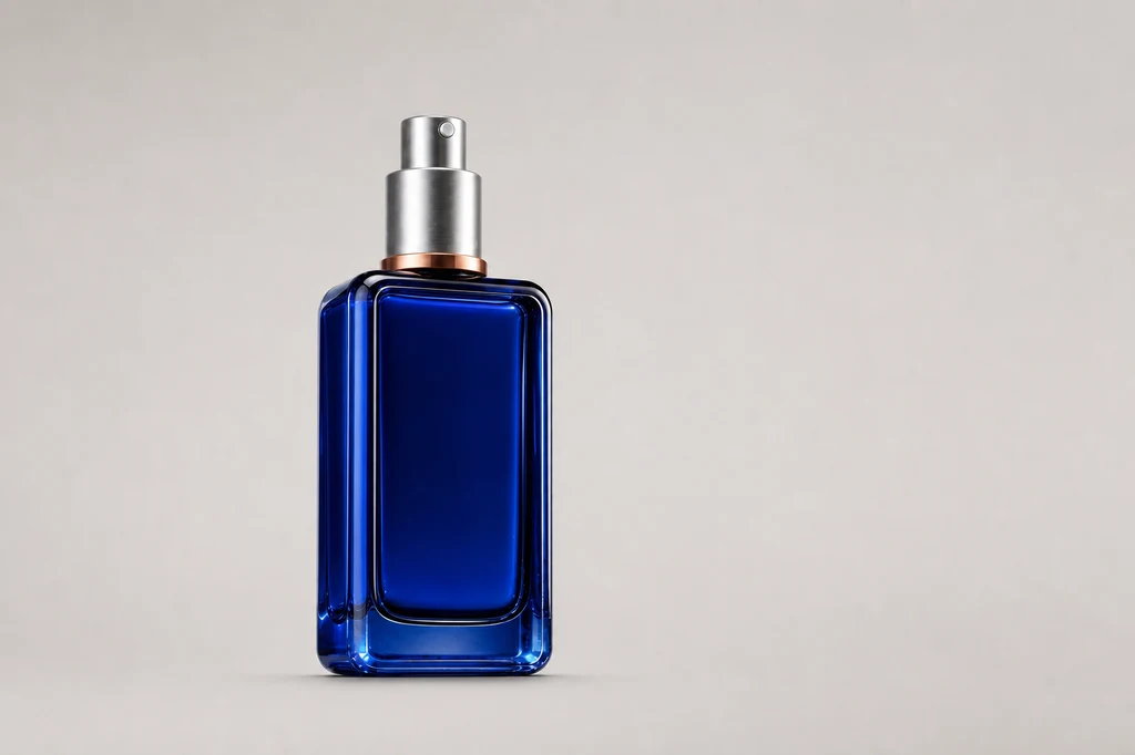
이미지 제작 프롬프트 — 기준 제품 컷
Use case: product-mockup
Asset type: instructional blog illustration showing the clean source product photograph
Input images: Image 1 is the identity reference for the exact product. Preserve the same cobalt-blue rectangular glass bottle, softly rounded shoulders, thick clear-blue glass edges, brushed-silver cylindrical pump cap, thin copper collar ring, proportions, and unbranded front.
Primary request: Create a clean professional source packshot that could be used as the starting product image for an AI advertising-flyer workflow.
Scene/backdrop: seamless pale warm-gray studio cyclorama with no horizon seam.
Subject: exactly one identical bottle from Image 1, standing upright, centered slightly left, front three-quarter angle, fully visible with generous padding.
Style/medium: photorealistic commercial catalog product photography.
Composition/framing: 3:2 landscape; product occupies about 42 percent of frame height; broad empty space around it for easy selection and masking.
Lighting/mood: large diffused softbox from upper left, gentle fill from right, controlled specular edge highlights, realistic soft contact shadow directly beneath.
Color palette: neutral warm gray, cobalt blue, silver, copper.
Materials/textures: preserve thick blue glass and brushed metal with crisp realistic edges; clean surface with no dust.
Constraints: preserve the exact product identity from Image 1; no redesign; no additional products; no props; no text; no label; no logo; no watermark; no colored background spill; no clipping.
Avoid: dramatic ad background, water, floating particles, hard shadows, distorted pump, duplicate bottle, reflections that obscure the silhouette.
실제 라벨이 있다면 확대해서 철자, 로고 비율, 용량, 인증 마크와 바코드를 비교합니다. 정확히 보존되지 않으면 AI가 만든 라벨을 사용하지 말고 원본 라벨을 마스크 또는 별도 레이어로 다시 합성하세요.
2. 디자인 전에 한 문장 메시지와 정보 계층을 정한다
전단지의 목표를 “멋있게”가 아니라 “신제품 인지”, “매장 방문”, “기간 한정 구매”처럼 하나로 정합니다. 그다음 헤드라인, 핵심 혜택, 근거, 가격·기간, CTA 순서를 만듭니다. 생성 이미지에는 각 문구가 들어갈 빈 공간만 만들고 정확한 문장은 나중에 조판하는 편이 안전합니다.
| 정보 층 | 권장 역할 | 실무 규칙 |
|---|---|---|
| 헤드라인 | 한 번에 관심 확보 | 가장 큰 글자, 한 메시지 |
| 핵심 혜택 | 왜 필요한지 설명 | 1~2개만 유지 |
| 근거 | 성분·기능·조건 | 검증된 표현만 사용 |
| 가격·기간 | 행동 판단 정보 | 단위와 날짜 재검수 |
| CTA | 다음 행동 지시 | 짧은 동사형 문장 |
3. 상품은 고정하고 배경·빛·접촉 그림자만 바꾼다
좋은 합성은 배경이 화려한 것이 아니라 상품이 그 공간에 실제로 놓인 것처럼 보이는 것입니다. 기준 상품을 참조로 지정하고, 환경·위치·광원만 바꾸며 캡·병 비율·색·전면 방향은 유지합니다. 배경 오브젝트는 상품 뒤나 아래에 두어 윤곽을 가리지 않게 합니다.
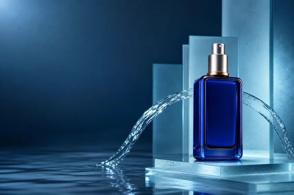
이미지 제작 프롬프트 — 상품 보존 배경 합성
Use case: compositing
Asset type: instructional blog illustration showing subject-preserving background generation for a product ad
Input images: Image 1 is the exact product reference and identity anchor.
Primary request: Place the unchanged cobalt-blue serum bottle from Image 1 into a premium aquatic advertising scene while preserving every product-defining feature.
Scene/backdrop: sculptural pale-cyan frosted glass slabs, a shallow mirror-like water surface, one elegant controlled water ribbon curving behind the product, subtle soft haze, and a dark navy-to-teal gradient distance.
Subject: exactly one identical bottle from Image 1 with the same rectangular proportions, rounded shoulders, thick cobalt glass, brushed-silver pump cap, copper collar ring, unbranded front, and front three-quarter orientation.
Style/medium: photorealistic luxury skincare campaign photography.
Composition/framing: 3:2 landscape. Product on the right third, fully visible and grounded on a low frosted-glass step. Preserve a broad quiet negative-space field on the left for future headline and benefit copy. Keep water and props behind or below the product silhouette.
Lighting/mood: cool cyan rim light matched to the bottle, soft white key light from upper left, subtle copper bounce near the collar, controlled reflection and soft grounded shadow.
Color palette: deep navy, pale cyan, cobalt, silver, restrained copper.
Materials/textures: precise glass refraction, brushed metal, clean water, frosted acrylic.
Constraints: preserve product identity and geometry from Image 1; change only environment, lighting integration, and placement; no label; no text; no letters; no numbers; no logo; no watermark; no people; no duplicate product; intentional copy space.
Avoid: liquid covering the bottle, fantasy deformation, excessive splash, crowded props, cheap neon, floating product, altered cap or collar.
병이 떠 보이면 접촉 그림자의 방향과 부드러움을 지정하고, 유리 가장자리 색이 배경과 맞지 않으면 림 라이트를 조정합니다. 상품 위를 지나가는 물·연기·장식은 피하는 편이 마스킹과 상품 인식을 안정시킵니다.
4. 한 구도에 집착하지 말고 세 가지 레이아웃을 비교한다
상품 위치만 조금씩 바꾼 변형보다 정보 구조가 다른 후보를 만드세요. 최소 편집형은 넓은 카피 영역, 중앙형은 강한 제품 집중, 대각선형은 시선 이동과 역동성이 장점입니다. 같은 색·광원·소품 체계를 유지하면 서로 다른 레이아웃도 하나의 캠페인처럼 보입니다.
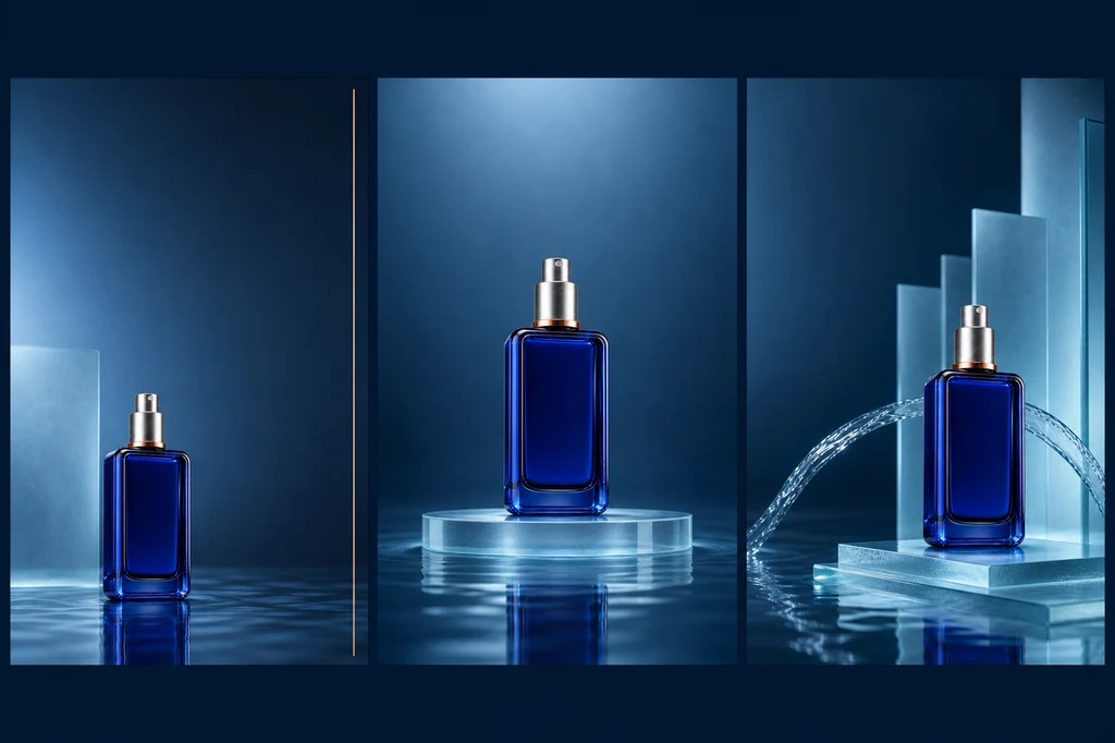
이미지 제작 프롬프트 — 세 가지 레이아웃 후보
Use case: ads-marketing
Asset type: instructional blog illustration comparing three advertising-flyer layout directions
Input images: Image 1 is the exact product identity reference. Image 2 is the approved aquatic campaign palette and material reference.
Primary request: Create a single sophisticated landscape presentation board containing three clearly separated vertical flyer concept panels side by side, all using the exact same cobalt-blue serum bottle. Demonstrate three useful layout systems without adding any text.
Panel 1: minimal editorial composition, bottle low-left, broad clean upper-right copy space, one thin copper rule.
Panel 2: centered symmetric hero composition, bottle centered on a translucent circular plinth, generous quiet space above and below for copy.
Panel 3: dynamic diagonal composition, bottle right-lower third, controlled water ribbon and frosted planes leading from left to right, clean upper-left copy space.
Style/medium: photorealistic luxury product campaign concepts displayed as a high-end art-direction contact sheet.
Composition/framing: 3:2 landscape overall, three equal panels with narrow clean navy gutters, consistent safe margins and visual scale.
Lighting/mood: coherent cool cyan studio light, subtle copper highlight, premium and restrained.
Color palette: midnight navy, cobalt, pale cyan, brushed silver, copper.
Materials/textures: thick blue glass, brushed metal, frosted acrylic, controlled water reflection.
Constraints: preserve the exact product design from Image 1 in all three panels; exactly one bottle per panel; no labels; no readable text; no placeholder letters; no numbers; no logos; no watermark; no decorative UI; panels must be visually distinct yet brand-consistent.
Avoid: duplicated bottle within a panel, distorted pump, inconsistent bottle color, excessive splash, clutter, tiny illegible type, random symbols.
후보를 작은 썸네일로 줄였을 때 제품이 먼저 보이는지, 카피 영역이 장식과 충돌하지 않는지, 모바일 광고로 잘라도 핵심 피사체가 남는지를 비교합니다.
5. 카피는 편집 도구에서 올리고 출력 조건을 검수한다
승인된 배경 이미지를 잠그고 헤드라인·혜택·가격·CTA를 벡터 텍스트로 추가합니다. 글꼴은 2종 이하, 정렬 축은 하나, 강조 색은 상품의 보조색에서 고르는 것이 안정적입니다. 가격, 할인율, 기간, 성분 효능과 법적 고지는 원문 데이터와 대조합니다.
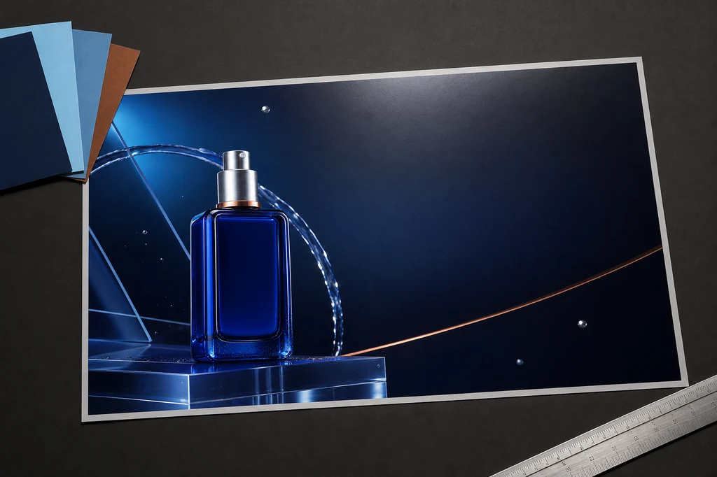
이미지 제작 프롬프트 — 인쇄 시안 검수 목업
Use case: product-mockup
Asset type: instructional blog illustration showing final advertising-flyer production and print-quality review
Input images: Image 1 is the approved final campaign artwork and layout reference. Image 2 is the exact product identity anchor.
Primary request: Create a photorealistic art-director desk scene displaying a finished landscape advertising flyer for the same cobalt-blue serum bottle, ready for final typography to be added in a design application.
Scene/backdrop: refined dark-charcoal creative studio desk with one large landscape flyer print lying nearly flat at a slight perspective angle, a small fan of three navy/cyan/copper color swatches, a silver precision ruler, and one soft proofing light reflection.
Subject: the printed flyer prominently reproduces the exact bottle and the approved midnight-navy campaign artwork from Image 1. The flyer preserves an elegant empty headline area on the right and a smaller empty offer/CTA zone below it.
Style/medium: high-end photorealistic print-production mockup, restrained editorial art direction.
Composition/framing: 3:2 landscape. Flyer occupies most of the frame and remains fully visible inside safe margins. Accessories stay at the edges and never cover the product or copy zones.
Lighting/mood: neutral color-accurate overhead proofing light, soft shadow beneath paper, subtle cyan reflections, premium professional mood.
Color palette: charcoal, midnight navy, cobalt blue, pale cyan, brushed silver, restrained copper.
Materials/textures: matte premium paper with crisp print detail, metal ruler, cardstock swatches, realistic but clean desk texture.
Constraints: preserve the exact product design from Image 2 and campaign arrangement from Image 1; one flyer only; no readable text; no letters; no numbers; no logos; no watermark; no hands or people; no computer UI; no extra bottles outside the printed artwork.
Avoid: curled paper obscuring artwork, illegible fake typography, cluttered stationery, multiple flyers, warped bottle, glossy glare hiding the design, brand names.
인쇄물이라면 문서 크기, 도련, 안전 여백, 색상 모드와 출력소의 PDF 규격을 확인하세요. 온라인용은 각 플랫폼의 권장 비율로 별도 내보내고, 작은 화면에서도 CTA가 읽히는지 실제 크기로 확인합니다.
실패 해결표
| 실패 신호 | 원인 | 수정 순서 |
|---|---|---|
| 병 모양·캡이 바뀜 | 참조와 불변 조건 부족 | 기준 컷 재지정 → 형태 명시 |
| 상품이 떠 보임 | 접촉 그림자·반사 불일치 | 바닥면 → 그림자 → 림 라이트 |
| 카피 공간이 없음 | 장면 설명만 있고 레이아웃 없음 | 상품 위치 → 빈 영역 → 안전 여백 |
| 전단지가 촌스러움 | 색·소재·광원이 너무 많음 | 주색 2개와 강조색 1개로 축소 |
| 가격·문구 오탈자 | 생성 이미지에 텍스트 위임 | 텍스트 제거 → 편집 도구에서 조판 |
| 인쇄에서 어두움 | 화면 기준으로만 보정 | 출력 프로파일·교정지 확인 |
공개 전 체크리스트
- 원본 제품 사진과 브랜드 자산의 사용 권리를 확보했다.
- 제품 형태, 라벨, 색, 재질과 구성품이 실제 상품과 일치한다.
- 상품 효능, 가격, 할인, 기간과 법적 고지를 사람이 검증했다.
- 헤드라인, 혜택, 가격, CTA의 시각적 우선순위가 분명하다.
- 생성 이미지의 가짜 글자·로고·워터마크가 남아 있지 않다.
- 모바일·웹·인쇄 규격별 안전 여백과 실제 크기 가독성을 확인했다.
- 최신 플랫폼 약관과 상업적 이용 조건을 확인했다.
결론
세련된 AI 전단지는 거대한 한 문장 프롬프트보다 상품 기준 컷, 메시지 계층, 상품 보존 합성, 복수 레이아웃 비교, 정확한 조판과 출력 검수의 연결에서 나옵니다. AI는 분위기와 장면 탐색에 강하고, 사람은 상품 사실과 카피 정확성에 책임지는 분업이 가장 안정적입니다.
참고 자료
- OpenAI — Image generation guide
- Google Cloud — Subject customization for product images
- Adobe Firefly — Match image composition to a reference
- Adobe Firefly — Style reference images
생성 기능과 정책은 바뀔 수 있습니다. 실제 상품 광고는 플랫폼 약관뿐 아니라 표시·광고, 지식재산권과 업종별 규정을 별도로 확인하세요.