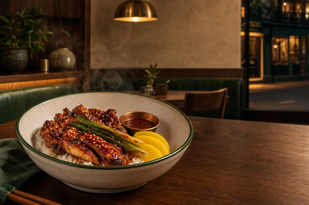
식당 홍보 포스터에서 가장 중요한 것은 화려함보다 “방문했을 때 사진과 같은 음식과 공간을 만날 수 있는가”입니다. AI가 접시 크기, 메뉴 양, 재료나 매장 외관을 바꾸면 보기에는 좋아도 고객의 기대와 실제 경험이 달라집니다.
Google Business Profile은 매장 사진이 초점과 조명이 좋고 현실을 대표해야 하며, 과도한 필터나 AI 수정을 피하라고 안내합니다. 따라서 이 가이드는 실제 매장·음식 사진을 기준으로 고정하고 AI에는 배경 정리, 광원 통합, 여백과 포스터 구도만 맡깁니다. 상호, 가격, 영업시간, 주소, 행사 기간과 CTA는 Canva·Adobe Express·Figma 같은 편집 도구에서 정확한 텍스트 레이어로 올립니다.
한눈에 보는 제작 흐름
| 단계 | 입력 | AI 작업 | 사람 검수 |
|---|---|---|---|
| 1. 목적 정의 | 행사·메뉴·채널 | 카피 초안 | 가격·기간·CTA |
| 2. 촬영 | 외관·실내·대표 메뉴 | 노출·배경 정리 | 실제 모습 일치 |
| 3. 비주얼 | 승인된 원본 사진 | 조명·구도·여백 | 양·재료·공간 보존 |
| 4. 레이아웃 | 정보 우선순위 | 3개 구도 후보 | 축소 가독성 |
| 5. 조판·출력 | 확정 문구 | 부분 이미지 수정 | 철자·규격·법적 표시 |
예시는 실제 브랜드가 아닌 가상의 동네 식당과 매콤한 글레이즈 치킨 덮밥을 사용합니다. 실제 제작에서는 매장 사진, 메뉴 사진, 로고와 폰트의 사용 권리를 먼저 확인하세요.
대표 이미지 제작 프롬프트
Use case: ads-marketing
Asset type: 3:2 landscape blog cover and restaurant promotional-poster key visual
Primary request: Create a polished editorial advertising composition for an original contemporary neighborhood restaurant, establishing a consistent restaurant and signature dish for later reference images.
Scene/backdrop: warm evening view inside a refined small restaurant with walnut wood, cream plaster walls, deep forest-green upholstery, handmade ceramic tableware, one round brushed-brass pendant lamp, and a softly visible storefront window in the distance. No existing brand or real location.
Subject: a signature spicy glazed grilled chicken rice bowl in a distinctive wide off-white handmade ceramic bowl with a thin forest-green rim; glossy mahogany-red chicken pieces over short-grain rice, charred scallions, sesame seeds, three pale-yellow pickled radish slices, and a small copper sauce cup. The exact bowl, plating, portion, garnishes, and restaurant materials must be clear and memorable for use as identity anchors in later images.
Style/medium: photorealistic high-end restaurant food photography combined with restrained contemporary editorial poster art direction.
Composition/framing: 3:2 landscape. Hero dish prominent in the lower-left and center-left on a walnut table, fully visible at a 35-degree angle. Preserve broad uncluttered negative space in the upper-right and right-center for a future restaurant name, offer, and call-to-action. The warmly lit interior and storefront cues sit softly in the background without competing with the food.
Lighting/mood: warm 3200K practical glow with a soft directional key from upper left, gentle steam, crisp but natural food highlights, restrained deep-green shadow accents, inviting evening mood.
Color palette: walnut brown, cream, forest green, brass, mahogany red, warm rice white.
Materials/textures: realistic glazed chicken, individual rice grains, hand-thrown matte ceramic, brushed brass, wood grain, clean linen.
Constraints: original fictional restaurant and dish; exactly one hero bowl; realistic edible portion; preserve truthful food texture; no people; no readable text; no letters; no numbers; no logo; no watermark; no menus; no trademarked packaging; no fake signage; safe margins; no excessive retouching.
Avoid: duplicated ingredients, floating garnish, plastic-looking food, impossible steam, oversaturated orange, clutter, fake typography, generic fast-food styling, extreme shallow focus that hides the dish.
1. 먼저 포스터의 행동 목표를 하나로 정한다
“식당 홍보”는 너무 넓습니다. 신메뉴 주문, 평일 저녁 방문, 예약, 포장 주문처럼 고객 행동 하나를 고르세요. 정보가 많을수록 헤드라인이 아니라 메뉴판이 됩니다.
| 정보 층 | 질문 | 권장 규칙 |
|---|---|---|
| 헤드라인 | 무엇이 새롭나 | 한 메시지, 가장 크게 |
| 메뉴·혜택 | 왜 먹어야 하나 | 대표 메뉴 1개 중심 |
| 근거 | 무엇이 실제인가 | 재료·조리법만 정확히 |
| 조건 | 언제·얼마인가 | 가격·기간·요일 명시 |
| CTA | 다음 행동은 | 예약·방문·주문 중 하나 |
건강 효능, 원산지, 할인율, 한정 수량처럼 객관적 사실로 받아들여지는 표현은 근거를 확보한 뒤 사용합니다. 음식이 더 많거나 크게 보이게 만드는 AI 수정도 피합니다.
2. 매장과 음식을 따로, 정직하게 촬영한다
외관은 고객이 접근하는 방향에서 출입구와 특징이 보이게 수평·수직을 맞춰 찍습니다. 실내는 실제 분위기를 보여주는 넓은 사진을, 음식은 판매되는 그릇·양·가니시 그대로 찍습니다. 음식은 35~45도 각도와 탑뷰를 함께 확보하고 확산광으로 반사와 그림자를 통제하면 후속 합성이 쉬워집니다.
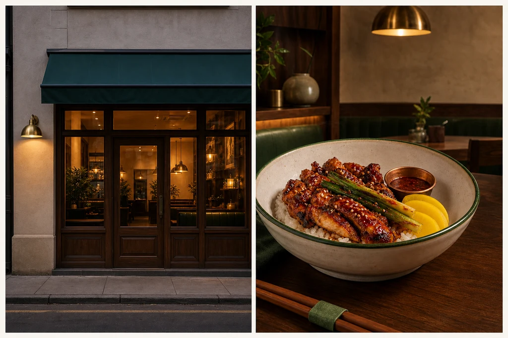
이미지 제작 프롬프트 — 매장·음식 기준 사진
Use case: productivity-visual
Asset type: 3:2 landscape instructional blog illustration showing the two honest source photographs required for a restaurant poster
Input images: Image 1 is the visual identity anchor. Preserve its exact fictional restaurant materials and exact signature dish.
Primary request: Create one elegant two-panel photographic contact sheet with no labels. The left panel shows the restaurant exterior source photograph; the right panel shows the signature food source photograph. Both should look like well-shot but minimally edited camera originals suitable for later AI-assisted poster production.
Left panel scene: street-level evening exterior of the same small contemporary restaurant from Image 1, with walnut-framed windows, cream plaster facade, deep forest-green awning with absolutely no writing, one round brushed-brass wall lamp, clean doorway, and warm interior visible through glass. Straight vertical architecture, entire entrance recognizable, no people.
Right panel scene: the exact same wide off-white handmade ceramic bowl with thin forest-green rim, mahogany-red spicy glazed grilled chicken over short-grain rice, charred scallions, sesame, exactly three pale-yellow pickled radish slices, and the same small copper sauce cup. Place it on the same walnut table at a 35-degree camera angle.
Style/medium: photorealistic documentary-commercial photography, truthful and lightly processed rather than a finished advertisement.
Composition/framing: 3:2 landscape overall, two equal panels separated by a narrow cream gutter; clear complete subjects with useful margins; storefront at eye level, food at 35 degrees.
Lighting/mood: evenly exposed blue-hour exterior and soft diffused window light for food, neutral white balance, natural shadows, no dramatic effects.
Color palette: walnut, cream, forest green, brushed brass, mahogany red, warm white.
Materials/textures: accurate facade plaster, clean glass, natural wood, realistic chicken glaze and rice grains, handmade ceramic.
Constraints: preserve the restaurant and dish identity from Image 1; no redesign; no extra dishes; no changed portion; no people; no readable text; no letters; no numbers; no logos; no watermark; no fake signage; no excessive filters; no impossible steam.
Avoid: fisheye distortion, tilted walls, oversaturated food, duplicate garnish, plastic food, fantasy storefront, fake menu boards, heavy vignette.
촬영 전에 테이블을 닦고 접시 가장자리의 소스를 정리하되, 실제로 제공하지 않는 재료를 추가하지 마세요. 외관의 전선이나 쓰레기처럼 일시적 방해물은 정리할 수 있지만 출입구, 창문, 차양과 좌석 구조를 바꾸면 안 됩니다.
3. AI에는 “바꿀 것”보다 “보존할 것”을 먼저 준다
참조 이미지 편집에서는 메뉴의 그릇, 양, 재료, 가니시 수와 매장 외관을 불변 조건으로 씁니다. 그다음 바꿀 수 있는 항목을 크롭, 화이트밸런스, 배경 분리, 접촉 그림자, 빈 카피 영역으로 제한합니다. OpenAI와 Gemini의 공식 문서도 이미지 입력을 이용한 반복 편집과 변경·보존 조건의 명시를 지원합니다.
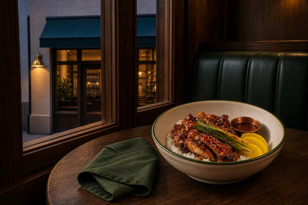
이미지 제작 프롬프트 — 사실성을 유지한 음식 사진 보정
Use case: compositing
Asset type: 3:2 landscape instructional blog illustration showing a truthful restaurant food-photo enhancement
Input images: Image 1 contains two identity references: left is the exact restaurant exterior; right is the exact signature dish. Preserve both faithfully.
Primary request: Create a refined promotional food photograph that places the unchanged signature dish from the right panel of Image 1 on a walnut table beside the recognizable restaurant window and forest-green banquette from the left panel. Improve lighting, crop, background separation, and table styling only; do not redesign or enlarge the food.
Scene/backdrop: inside the same restaurant at blue hour, with the walnut-framed front window softly showing the cream facade, forest-green awning, and warm brass wall lamp beyond. Add only a folded dark-green linen napkin and the same small copper sauce cup.
Subject: exactly the same wide off-white handmade bowl with thin forest-green rim; same quantity and shape of mahogany-red glazed grilled chicken, same rice, charred scallions, sesame, exactly three yellow pickled radish slices, same copper sauce cup.
Style/medium: photorealistic premium food editorial photograph, credible enough to represent the menu served.
Composition/framing: 3:2 landscape, dish fully visible in the right-lower third at a 35-degree angle; storefront cues softly recognizable on the left background; generous clean upper-left negative space for later poster copy; no cropping of bowl.
Lighting/mood: soft directional window light from left, warm practical glow from the brass lamp, subtle cool blue-hour rim, natural steam only, appetizing but honest.
Color palette: walnut, cream, forest green, brass, mahogany red, warm rice white.
Materials/textures: moist glaze without plastic shine, separate rice grains, charred scallion texture, matte handmade ceramic, natural wood.
Constraints: preserve exact menu identity, portion, bowl, garnish count, and restaurant architecture from Image 1; change only composition, lighting integration, minor background cleanup, and styling; no people; no text; no logos; no watermark; no invented ingredients; no oversized portion.
Avoid: food replacement, exaggerated cheese or steam, floating garnish, excessive saturation, fake shallow depth, deformed bowl, altered storefront, duplicated dish, misleading abundance.
원본과 결과를 나란히 놓고 그릇 윤곽, 닭고기 조각 수와 크기, 밥 양, 피클·소스, 매장 창과 차양을 비교하세요. 하나라도 달라졌다면 해당 요소를 원본에서 다시 합성하거나 생성 결과를 폐기합니다.
4. 음식·공간·이벤트 중심의 세 구도를 비교한다
같은 사진에 필터만 바꾸지 말고 목적이 다른 레이아웃을 만드세요. 음식 중심은 신메뉴, 공간 중심은 매장 경험과 오픈 안내, 이벤트 중심은 기간 한정 프로모션에 적합합니다. Adobe Firefly의 구성 참조는 외곽선과 깊이를 이용해 배치를 맞추고 강도로 참조 준수 수준을 조절할 수 있습니다.
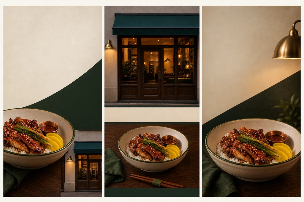
이미지 제작 프롬프트 — 세 가지 포스터 구도
Use case: ads-marketing
Asset type: 3:2 landscape instructional blog illustration comparing three restaurant-poster layout systems
Input images: Image 1 is the exact source-photo identity board for the restaurant and signature dish. Image 2 is the approved enhanced food photograph and campaign lighting reference. Preserve the exact facade, interior palette, bowl, food portion, garnishes, and copper sauce cup.
Primary request: Create a single sophisticated presentation board containing three clearly separated vertical restaurant-poster concept panels side by side. Each panel uses the same exact restaurant and signature dish but demonstrates a meaningfully different hierarchy. Do not generate any text.
Panel 1 — food-first: large bowl in lower-left, clean cream-and-dark-green negative space upper-right for a headline and offer, small storefront detail at bottom-right.
Panel 2 — place-first: recognizable storefront fills upper half, signature bowl on walnut table in lower half, calm centered composition with reserved empty bands for future name and location.
Panel 3 — event-first: dynamic cropped food hero on right-lower third, warm brass lamp and forest-green diagonal shapes guide the eye, broad empty upper-left zone for a limited-time message and CTA.
Style/medium: photorealistic restaurant campaign concepts presented as a premium art-direction contact sheet.
Composition/framing: 3:2 overall; three equal vertical panels with narrow cream gutters, consistent safe margins and balanced visual scale.
Lighting/mood: coherent warm restaurant glow, soft blue-hour accent, appetizing but natural food highlights.
Color palette: walnut brown, cream, forest green, brass, mahogany red, warm white.
Materials/textures: faithful food texture, handmade ceramic, wood grain, cream plaster, green fabric, brushed brass.
Constraints: exact restaurant and dish identity from references; exactly one dish per panel; no portion inflation; no changed ingredients; no readable text; no placeholder letters; no numbers; no logo; no watermark; no people; each panel visually distinct but campaign-consistent.
Avoid: fake typography, mismatched storefront, distorted bowl, excessive food crop, oversaturation, clutter, generic template UI, duplicated dishes inside a panel.
후보를 휴대폰 썸네일 크기로 줄여 2초 안에 메뉴와 핵심 메시지 영역이 보이는지 확인합니다. 장식이 글자 영역을 침범하면 생성 이미지를 늘리기보다 크롭과 배경 면을 조정하세요.
5. 정확한 문구는 편집 도구에서 조판한다
이미지 모델에는 빈 영역만 만들게 하고 다음 정보는 편집 가능한 텍스트로 추가합니다. 상호, 메뉴명, 실제 판매 가격, 행사 시작·종료일, 영업시간, 주소, 예약 또는 주문 방법입니다. 글꼴은 2종 이하, 정렬 축은 하나, 강조 색은 브랜드 보조색 하나로 제한하면 세련됨을 유지하기 쉽습니다.
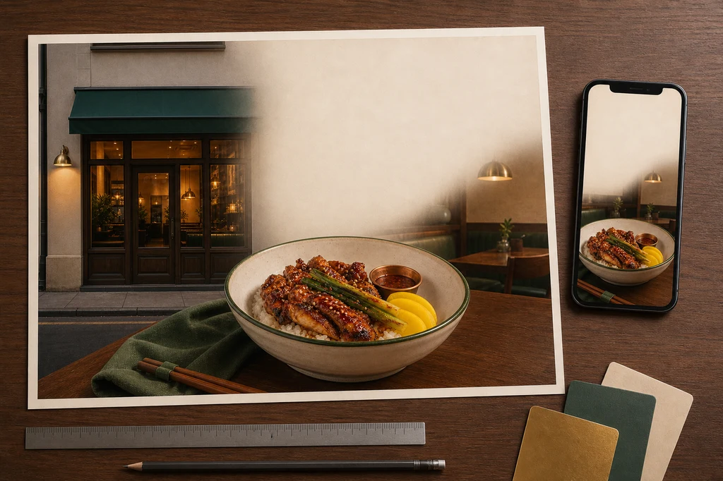
이미지 제작 프롬프트 — 인쇄·모바일 최종 검수
Use case: product-mockup
Asset type: 3:2 landscape instructional blog illustration showing final restaurant-poster proofing across print and mobile
Input images: Image 1 is the approved restaurant campaign key visual and exact signature dish. Image 2 is the source-photo identity board for the exact storefront and food. Preserve both faithfully.
Primary request: Create a photorealistic designer's proofing desk that displays one finished landscape restaurant-poster print and one upright smartphone-sized blank-frame mockup using the same approved campaign image. Both show the exact signature dish and recognizable storefront visual but intentionally leave clean empty zones where real restaurant name, price, hours, location, and CTA will later be typeset.
Scene/backdrop: tidy walnut design desk in a softly lit studio, with one large matte poster proof nearly flat, one slim dark smartphone mockup at the right edge, a small fan of cream/forest-green/brass color swatches, a silver ruler, and a pencil. No software UI.
Subject: poster and phone both reproduce the same exact off-white green-rimmed bowl, mahogany glazed chicken, rice, charred scallions, sesame, exactly three yellow pickled radish slices, copper sauce cup, and the same cream/walnut/green/brass restaurant cues.
Style/medium: high-end photorealistic print-production and campaign-consistency mockup.
Composition/framing: 3:2 landscape; poster occupies most of the frame and is fully visible within safe margins; phone is secondary and does not cover the print; accessories stay at edges. Clear blank headline, details, and CTA zones.
Lighting/mood: neutral color-accurate overhead proofing light, warm ambient spill, soft paper and device shadows, professional calm mood.
Color palette: walnut, cream, forest green, brass, mahogany red, warm white.
Materials/textures: matte premium paper, realistic food print detail, brushed metal ruler, cardstock swatches, dark glass phone surface.
Constraints: preserve exact dish, portion, bowl, garnish, storefront and palette from references; one print and one phone only; no readable text; no letters; no numbers; no logo; no watermark; no hands; no people; no fake app UI; no changed ingredients.
Avoid: warped paper hiding the image, glossy glare, duplicate bowls within one layout, fake typography, cluttered stationery, distorted phone, oversized food, unrelated branding.| 출력 채널 | 먼저 확인할 것 | 흔한 오류 |
|---|---|---|
| 매장 포스터 | 실물 크기·도련·거리 가독성 | 작은 가격·과한 정보 |
| SNS 피드 | 1:1·4:5 안전 영역 | 중요한 피사체 크롭 |
| 스토리·릴스 | 9:16 상하 UI 영역 | CTA가 버튼과 겹침 |
| 지도·프로필 | 현실을 대표하는 사진 | 과도한 AI 보정 |
실패 해결표
| 실패 신호 | 원인 | 수정 순서 |
|---|---|---|
| 음식 양·재료가 달라짐 | 보존 조건 부족 | 원본 재첨부 → 불변 항목 열거 |
| 음식이 플라스틱 같음 | 광택·채도 과다 | 하이라이트 → 채도 → 질감 |
| 매장이 다른 곳처럼 보임 | 외관 재생성 | 건축 고정 → 배경만 정리 |
| 카피 공간이 없음 | 장면만 설명 | 목표 → 피사체 위치 → 빈 영역 |
| 가격·시간이 틀림 | 생성 이미지에 글자 위임 | 글자 제거 → 편집 도구 조판 |
| 모바일에서 잘림 | 한 비율만 제작 | 채널별 크롭과 안전 영역 |
공개 전 체크리스트
- 음식의 양, 재료, 그릇과 가니시가 실제 판매 메뉴와 같다.
- 외관, 좌석과 분위기가 고객이 방문할 공간을 정확히 보여준다.
- 상호, 가격, 날짜, 영업시간, 주소와 CTA를 사람이 확인했다.
- 할인, 원산지, 건강·품질 표현에 필요한 근거가 있다.
- 사진·로고·폰트 사용 권리와 최신 플랫폼 정책을 확인했다.
- 인쇄, 피드, 세로형에서 핵심 정보가 안전 영역 안에 있다.
- 생성 이미지의 가짜 글자, 로고와 워터마크가 남아 있지 않다.
결론
좋은 AI 식당 포스터는 현실을 대신 만드는 작업이 아니라, 실제 매장과 음식의 매력을 더 명확히 편집하는 작업입니다. 촬영 단계에서 정직한 기준을 만들고, AI 편집 범위를 조명·배경·구도로 제한하며, 사실 정보는 사람이 조판·검수하면 세련됨과 신뢰를 함께 지킬 수 있습니다.
참고 자료
- Google Business Profile — Tips for business-specific photos
- Google Business Profile — Get started for restaurants
- OpenAI — Image generation guide
- Google AI — Image generation and editing
- Adobe Firefly — Match image composition to a reference
- Adobe Firefly — Style reference image
생성 기능과 정책은 바뀔 수 있습니다. 실제 광고는 지역별 표시·광고, 식품, 원산지와 가격 표시 규정을 별도로 확인하세요.