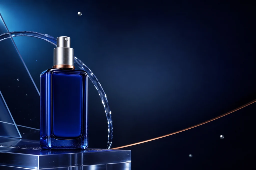
The most damaging failure in an AI advertising flyer is not an unfashionable background—it is a product that no longer matches what customers will receive. Changed proportions, caps, labels, colors, or materials make even a beautiful creative unusable. Asking an image model to render every price, claim, and legal line also invites consequential typos.
This guide locks a product reference, generates the setting and composition, and adds exact copy later as editable type in Canva, Adobe Express, Figma, or another layout tool. OpenAI supports iterative editing with image inputs, Google's product-customization guidance covers placing a referenced product in new scenes, and Adobe Firefly separates composition and style references for different kinds of control.
End-to-end workflow
| Stage | Deliverable | Let AI handle | Human approval |
|---|---|---|---|
| 1. Product anchor | Clean packshot | Background cleanup and light | Geometry, label, and color |
| 2. Message system | Headline, benefit, CTA | Copy exploration | Claims, price, and wording |
| 3. Campaign scene | Composite image | Environment and materials | Edges, shadow, and identity |
| 4. Layout | Three directions | Flow and negative space | Hierarchy and readability |
| 5. Typeset and export | Final flyer | Local image corrections | Exact copy and production spec |
The example uses an original unbranded cobalt-blue glass serum bottle. In production, secure the required rights for product photos, logos, copy, and background references before using them.
Cover image production prompt
Use case: ads-marketing
Asset type: landscape blog cover and finished advertising-flyer example
Primary request: Create a polished, premium advertising flyer composition for an original unbranded skincare serum product.
Scene/backdrop: deep midnight-navy studio environment with a soft cyan-to-indigo radial glow, translucent acrylic planes, a delicate arc of clear water, a few restrained floating silver particles, and a refined copper accent line.
Subject: one distinctive cobalt-blue rectangular glass serum bottle with softly rounded shoulders, a brushed-silver cylindrical pump cap, a thin copper collar ring, and no label or logo. The exact bottle design must be clear and memorable for use in later reference images.
Style/medium: photorealistic luxury product photography combined with sophisticated editorial graphic design.
Composition/framing: 3:2 landscape. Place the bottle prominently in the left third on a low translucent acrylic plinth. Preserve generous clean negative space across the upper-right and center-right for a future headline, plus a smaller quiet area at the lower-right for future price and call-to-action copy. Strong diagonal visual flow without clutter.
Lighting/mood: controlled studio key light from upper left, cool cyan rim light, subtle warm copper reflection, crisp glass edges, premium and calm rather than flashy.
Color palette: midnight navy, cobalt blue, icy cyan, brushed silver, restrained copper.
Materials/textures: realistic thick blue glass, fine condensation only near the bottle base, polished acrylic, controlled soft shadows and reflections.
Constraints: original product design; no people; no readable text; no letters; no numbers; no logos; no trademarked packaging; no watermark; no mockup frame; no UI; no gibberish typography. Keep all important objects inside safe margins and make the negative space intentional.
Avoid: duplicated bottles, malformed pump, excessive water splash, busy particles, cheap neon cyberpunk, illegible labels, overexposure.
1. Prepare a product image that can function as the source of truth
Use one complete product with enough resolution to inspect edges and reflections. Translucent bottles and metal caps absorb surrounding color, so a neutral background and broad diffused light are useful. Tell the model to preserve the same object instead of redesigning it.
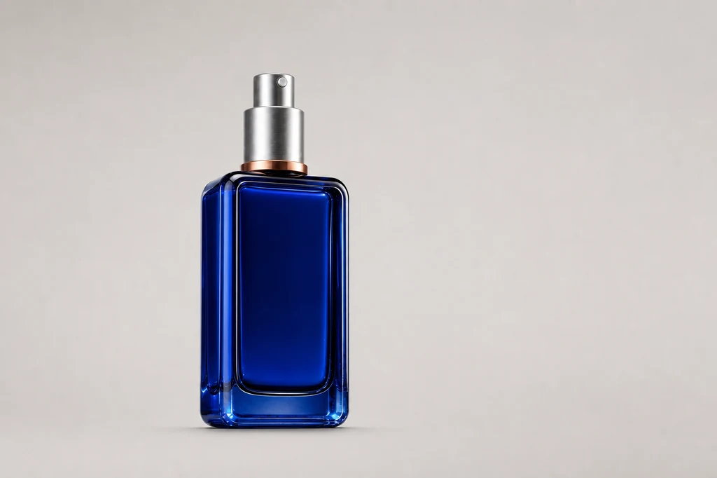
Image production prompt — source packshot
Use case: product-mockup
Asset type: instructional blog illustration showing the clean source product photograph
Input images: Image 1 is the identity reference for the exact product. Preserve the same cobalt-blue rectangular glass bottle, softly rounded shoulders, thick clear-blue glass edges, brushed-silver cylindrical pump cap, thin copper collar ring, proportions, and unbranded front.
Primary request: Create a clean professional source packshot that could be used as the starting product image for an AI advertising-flyer workflow.
Scene/backdrop: seamless pale warm-gray studio cyclorama with no horizon seam.
Subject: exactly one identical bottle from Image 1, standing upright, centered slightly left, front three-quarter angle, fully visible with generous padding.
Style/medium: photorealistic commercial catalog product photography.
Composition/framing: 3:2 landscape; product occupies about 42 percent of frame height; broad empty space around it for easy selection and masking.
Lighting/mood: large diffused softbox from upper left, gentle fill from right, controlled specular edge highlights, realistic soft contact shadow directly beneath.
Color palette: neutral warm gray, cobalt blue, silver, copper.
Materials/textures: preserve thick blue glass and brushed metal with crisp realistic edges; clean surface with no dust.
Constraints: preserve the exact product identity from Image 1; no redesign; no additional products; no props; no text; no label; no logo; no watermark; no colored background spill; no clipping.
Avoid: dramatic ad background, water, floating particles, hard shadows, distorted pump, duplicate bottle, reflections that obscure the silhouette.
For a real label, zoom in and compare spelling, logo proportions, volume, certification marks, and barcode. If those details drift, do not use the generated label. Mask the original label back in or rebuild it as a separate approved layer.
2. Define one objective and a hierarchy before designing
Replace “make it stylish” with one objective such as product awareness, store visits, or a limited-time purchase. Build the hierarchy as headline, main benefit, evidence, price or date, and CTA. Ask the image model to preserve empty zones for those layers rather than rendering final copy.
| Information layer | Purpose | Practical rule |
|---|---|---|
| Headline | Capture attention | Largest type, one message |
| Main benefit | Explain relevance | Keep one or two benefits |
| Evidence | Support the claim | Use verified language only |
| Price and date | Enable a decision | Recheck units and dates |
| CTA | Direct the next action | Use a short action phrase |
3. Change the environment while locking the product
A strong composite makes the product look physically present rather than merely surrounded by impressive effects. Mark the packshot as the identity reference, change only environment, placement, and integrated lighting, and preserve cap, bottle proportions, color, and facing direction. Keep scene elements behind or below the silhouette.
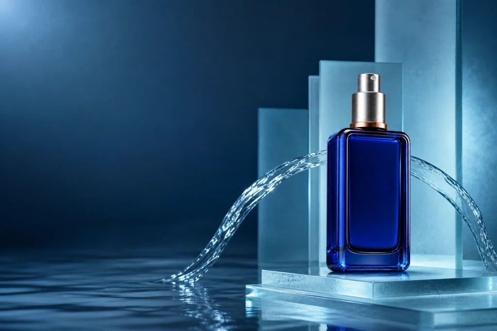
Image production prompt — subject-preserving composite
Use case: compositing
Asset type: instructional blog illustration showing subject-preserving background generation for a product ad
Input images: Image 1 is the exact product reference and identity anchor.
Primary request: Place the unchanged cobalt-blue serum bottle from Image 1 into a premium aquatic advertising scene while preserving every product-defining feature.
Scene/backdrop: sculptural pale-cyan frosted glass slabs, a shallow mirror-like water surface, one elegant controlled water ribbon curving behind the product, subtle soft haze, and a dark navy-to-teal gradient distance.
Subject: exactly one identical bottle from Image 1 with the same rectangular proportions, rounded shoulders, thick cobalt glass, brushed-silver pump cap, copper collar ring, unbranded front, and front three-quarter orientation.
Style/medium: photorealistic luxury skincare campaign photography.
Composition/framing: 3:2 landscape. Product on the right third, fully visible and grounded on a low frosted-glass step. Preserve a broad quiet negative-space field on the left for future headline and benefit copy. Keep water and props behind or below the product silhouette.
Lighting/mood: cool cyan rim light matched to the bottle, soft white key light from upper left, subtle copper bounce near the collar, controlled reflection and soft grounded shadow.
Color palette: deep navy, pale cyan, cobalt, silver, restrained copper.
Materials/textures: precise glass refraction, brushed metal, clean water, frosted acrylic.
Constraints: preserve product identity and geometry from Image 1; change only environment, lighting integration, and placement; no label; no text; no letters; no numbers; no logo; no watermark; no people; no duplicate product; intentional copy space.
Avoid: liquid covering the bottle, fantasy deformation, excessive splash, crowded props, cheap neon, floating product, altered cap or collar.
If the product floats, specify the ground plane and contact-shadow softness. If glass edges do not belong to the environment, align the rim light. Avoid water, smoke, or decoration crossing the product because those make selection and recognition harder.
4. Compare three genuinely different layout systems
Do not generate near-identical product positions. A minimal editorial direction provides broad copy space, a centered direction maximizes product focus, and a diagonal direction creates movement. Reusing color, light, and material rules keeps them inside one campaign system.
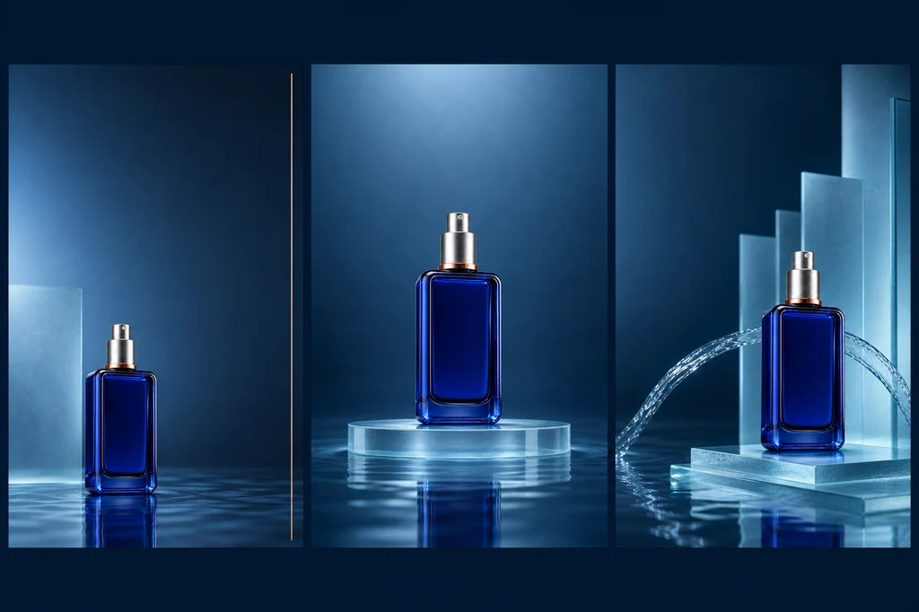
Image production prompt — three layout directions
Use case: ads-marketing
Asset type: instructional blog illustration comparing three advertising-flyer layout directions
Input images: Image 1 is the exact product identity reference. Image 2 is the approved aquatic campaign palette and material reference.
Primary request: Create a single sophisticated landscape presentation board containing three clearly separated vertical flyer concept panels side by side, all using the exact same cobalt-blue serum bottle. Demonstrate three useful layout systems without adding any text.
Panel 1: minimal editorial composition, bottle low-left, broad clean upper-right copy space, one thin copper rule.
Panel 2: centered symmetric hero composition, bottle centered on a translucent circular plinth, generous quiet space above and below for copy.
Panel 3: dynamic diagonal composition, bottle right-lower third, controlled water ribbon and frosted planes leading from left to right, clean upper-left copy space.
Style/medium: photorealistic luxury product campaign concepts displayed as a high-end art-direction contact sheet.
Composition/framing: 3:2 landscape overall, three equal panels with narrow clean navy gutters, consistent safe margins and visual scale.
Lighting/mood: coherent cool cyan studio light, subtle copper highlight, premium and restrained.
Color palette: midnight navy, cobalt, pale cyan, brushed silver, copper.
Materials/textures: thick blue glass, brushed metal, frosted acrylic, controlled water reflection.
Constraints: preserve the exact product design from Image 1 in all three panels; exactly one bottle per panel; no labels; no readable text; no placeholder letters; no numbers; no logos; no watermark; no decorative UI; panels must be visually distinct yet brand-consistent.
Avoid: duplicated bottle within a panel, distorted pump, inconsistent bottle color, excessive splash, clutter, tiny illegible type, random symbols.
Review each concept as a small thumbnail. Confirm the product reads first, decorative forms do not collide with copy, and a mobile crop can retain the focal object.
5. Add exact copy in a layout tool and proof the output
Lock the approved background, then add headline, benefits, price, and CTA as editable vector type. Use no more than two type families, one alignment axis, and an accent color drawn from the product. Compare price, discount, dates, claims, and legal language against the source record.
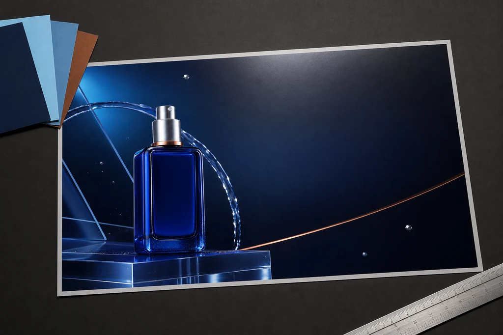
Image production prompt — print proof mockup
Use case: product-mockup
Asset type: instructional blog illustration showing final advertising-flyer production and print-quality review
Input images: Image 1 is the approved final campaign artwork and layout reference. Image 2 is the exact product identity anchor.
Primary request: Create a photorealistic art-director desk scene displaying a finished landscape advertising flyer for the same cobalt-blue serum bottle, ready for final typography to be added in a design application.
Scene/backdrop: refined dark-charcoal creative studio desk with one large landscape flyer print lying nearly flat at a slight perspective angle, a small fan of three navy/cyan/copper color swatches, a silver precision ruler, and one soft proofing light reflection.
Subject: the printed flyer prominently reproduces the exact bottle and the approved midnight-navy campaign artwork from Image 1. The flyer preserves an elegant empty headline area on the right and a smaller empty offer/CTA zone below it.
Style/medium: high-end photorealistic print-production mockup, restrained editorial art direction.
Composition/framing: 3:2 landscape. Flyer occupies most of the frame and remains fully visible inside safe margins. Accessories stay at the edges and never cover the product or copy zones.
Lighting/mood: neutral color-accurate overhead proofing light, soft shadow beneath paper, subtle cyan reflections, premium professional mood.
Color palette: charcoal, midnight navy, cobalt blue, pale cyan, brushed silver, restrained copper.
Materials/textures: matte premium paper with crisp print detail, metal ruler, cardstock swatches, realistic but clean desk texture.
Constraints: preserve the exact product design from Image 2 and campaign arrangement from Image 1; one flyer only; no readable text; no letters; no numbers; no logos; no watermark; no hands or people; no computer UI; no extra bottles outside the printed artwork.
Avoid: curled paper obscuring artwork, illegible fake typography, cluttered stationery, multiple flyers, warped bottle, glossy glare hiding the design, brand names.
For print, follow the printer's document size, bleed, safe area, color, and PDF requirements. Export separate ratios for digital placements and inspect CTA readability at real mobile size.
Troubleshooting
| Signal | Likely cause | Repair order |
|---|---|---|
| Bottle or cap changes | Weak reference constraints | Reattach anchor → state invariants |
| Product appears to float | Shadow and reflection mismatch | Ground plane → shadow → rim light |
| No room for copy | Scene prompt without layout | Product position → empty zone → margin |
| Creative looks cheap | Too many colors and materials | Reduce to two main colors plus one accent |
| Copy or price is wrong | Text delegated to image generation | Remove text → typeset in layout tool |
| Print is too dark | Tuned only for a screen | Check profile and physical proof |
Preflight checklist
- Rights for the product photo and brand assets are secured.
- Product geometry, label, color, material, and included parts match reality.
- Claims, price, discount, dates, and legal language were reviewed by a person.
- Headline, benefit, price, and CTA have an obvious hierarchy.
- No fake lettering, unintended logos, or watermarks remain.
- Safe areas and legibility were tested for mobile, web, and print outputs.
- Current platform terms and commercial-use conditions were checked.
Conclusion
A stylish AI flyer comes from a chain of controls: a reliable packshot, a clear message hierarchy, subject-preserving compositing, meaningful layout alternatives, accurate typesetting, and production proofing. AI is effective at exploring scenes and mood; people remain accountable for product truth and copy accuracy.
Sources
- OpenAI — Image generation guide
- Google Cloud — Subject customization for product images
- Adobe Firefly — Match image composition to a reference
- Adobe Firefly — Style reference images
Generation features and policies change. Real product advertising also requires separate review of advertising, intellectual-property, and sector-specific rules.