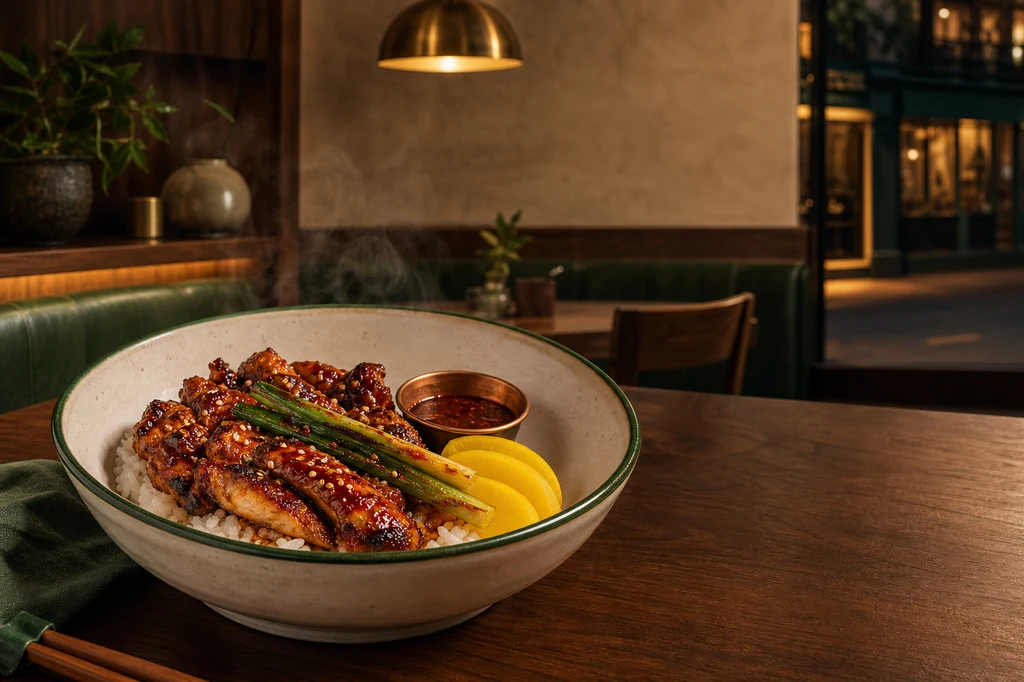
A restaurant poster succeeds when guests can arrive and recognize the food and place they saw. If AI changes the bowl, portion, ingredients, or storefront, an attractive image becomes a misleading promise.
Google Business Profile recommends focused, well-lit photos that represent reality and avoids significant alterations or excessive filters or AI. This guide therefore locks the real store and dish as references. AI may refine exposure, background separation, lighting, negative space, and composition; the restaurant name, price, hours, address, promotion dates, and CTA are added later as editable type in Canva, Adobe Express, or Figma.
Workflow at a glance
| Stage | Input | AI task | Human check |
|---|---|---|---|
| 1. Objective | offer, dish, channel | copy draft | price, dates, CTA |
| 2. Capture | exterior, interior, hero dish | exposure cleanup | truthful appearance |
| 3. Key visual | approved source photos | light, crop, negative space | portion and place preserved |
| 4. Layout | information hierarchy | three concepts | thumbnail readability |
| 5. Typeset/export | approved facts | local image repair | spelling and specifications |
The example uses a fictional neighborhood restaurant and spicy glazed chicken rice bowl, not a real brand. Confirm rights to every restaurant photo, dish photo, logo, and typeface before production.
Cover image prompt
Use case: ads-marketing
Asset type: 3:2 landscape blog cover and restaurant promotional-poster key visual
Primary request: Create a polished editorial advertising composition for an original contemporary neighborhood restaurant, establishing a consistent restaurant and signature dish for later reference images.
Scene/backdrop: warm evening view inside a refined small restaurant with walnut wood, cream plaster walls, deep forest-green upholstery, handmade ceramic tableware, one round brushed-brass pendant lamp, and a softly visible storefront window in the distance. No existing brand or real location.
Subject: a signature spicy glazed grilled chicken rice bowl in a distinctive wide off-white handmade ceramic bowl with a thin forest-green rim; glossy mahogany-red chicken pieces over short-grain rice, charred scallions, sesame seeds, three pale-yellow pickled radish slices, and a small copper sauce cup. The exact bowl, plating, portion, garnishes, and restaurant materials must be clear and memorable for use as identity anchors in later images.
Style/medium: photorealistic high-end restaurant food photography combined with restrained contemporary editorial poster art direction.
Composition/framing: 3:2 landscape. Hero dish prominent in the lower-left and center-left on a walnut table, fully visible at a 35-degree angle. Preserve broad uncluttered negative space in the upper-right and right-center for a future restaurant name, offer, and call-to-action. The warmly lit interior and storefront cues sit softly in the background without competing with the food.
Lighting/mood: warm 3200K practical glow with a soft directional key from upper left, gentle steam, crisp but natural food highlights, restrained deep-green shadow accents, inviting evening mood.
Color palette: walnut brown, cream, forest green, brass, mahogany red, warm rice white.
Materials/textures: realistic glazed chicken, individual rice grains, hand-thrown matte ceramic, brushed brass, wood grain, clean linen.
Constraints: original fictional restaurant and dish; exactly one hero bowl; realistic edible portion; preserve truthful food texture; no people; no readable text; no letters; no numbers; no logo; no watermark; no menus; no trademarked packaging; no fake signage; safe margins; no excessive retouching.
Avoid: duplicated ingredients, floating garnish, plastic-looking food, impossible steam, oversaturated orange, clutter, fake typography, generic fast-food styling, extreme shallow focus that hides the dish.
1. Choose one customer action
“Promote the restaurant” is too broad. Choose one action: try a new dish, visit on a weekday evening, reserve, or order takeaway. A poster that attempts to show the whole menu rarely creates hierarchy.
| Layer | Question | Rule |
|---|---|---|
| Headline | What is new? | one message, largest type |
| Dish/benefit | Why try it? | one hero dish |
| Proof | What is factual? | verified ingredients or method |
| Conditions | When and how much? | state price, dates, days |
| CTA | What next? | reserve, visit, or order |
Substantiate origin, discount, quantity, quality, and health-related claims. Do not use AI to make the serving look larger or more abundant than the menu item.
2. Photograph the place and food separately and honestly
Capture the facade from the direction customers approach, with straight verticals and a recognizable entrance. Record the interior atmosphere in a wide shot. Photograph the dish in the serving bowl, real portion, and actual garnish. A 35–45 degree view plus a top view and broad diffused light provide flexible source material.
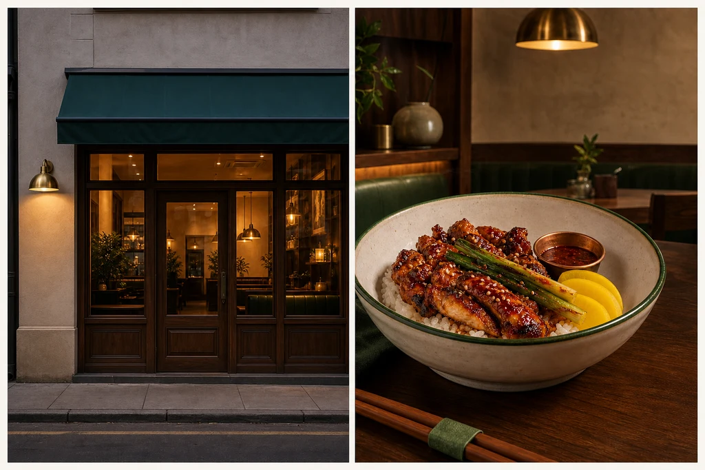
Image prompt — restaurant and dish source photographs
Use case: productivity-visual
Asset type: 3:2 landscape instructional blog illustration showing the two honest source photographs required for a restaurant poster
Input images: Image 1 is the visual identity anchor. Preserve its exact fictional restaurant materials and exact signature dish.
Primary request: Create one elegant two-panel photographic contact sheet with no labels. The left panel shows the restaurant exterior source photograph; the right panel shows the signature food source photograph. Both should look like well-shot but minimally edited camera originals suitable for later AI-assisted poster production.
Left panel scene: street-level evening exterior of the same small contemporary restaurant from Image 1, with walnut-framed windows, cream plaster facade, deep forest-green awning with absolutely no writing, one round brushed-brass wall lamp, clean doorway, and warm interior visible through glass. Straight vertical architecture, entire entrance recognizable, no people.
Right panel scene: the exact same wide off-white handmade ceramic bowl with thin forest-green rim, mahogany-red spicy glazed grilled chicken over short-grain rice, charred scallions, sesame, exactly three pale-yellow pickled radish slices, and the same small copper sauce cup. Place it on the same walnut table at a 35-degree camera angle.
Style/medium: photorealistic documentary-commercial photography, truthful and lightly processed rather than a finished advertisement.
Composition/framing: 3:2 landscape overall, two equal panels separated by a narrow cream gutter; clear complete subjects with useful margins; storefront at eye level, food at 35 degrees.
Lighting/mood: evenly exposed blue-hour exterior and soft diffused window light for food, neutral white balance, natural shadows, no dramatic effects.
Color palette: walnut, cream, forest green, brushed brass, mahogany red, warm white.
Materials/textures: accurate facade plaster, clean glass, natural wood, realistic chicken glaze and rice grains, handmade ceramic.
Constraints: preserve the restaurant and dish identity from Image 1; no redesign; no extra dishes; no changed portion; no people; no readable text; no letters; no numbers; no logos; no watermark; no fake signage; no excessive filters; no impossible steam.
Avoid: fisheye distortion, tilted walls, oversaturated food, duplicate garnish, plastic food, fantasy storefront, fake menu boards, heavy vignette.
Clean the table and plate rim before shooting, but do not add ingredients that are not served. Temporary distractions can be removed; doors, windows, awning, seating, and architectural identity should not be redesigned.
3. Tell the model what must stay unchanged
List the bowl, portion, ingredients, garnish count, and storefront geometry as invariants. Limit permissible changes to crop, white balance, background cleanup, lighting integration, contact shadow, and copy space. Official OpenAI and Gemini guidance supports image-input editing and explicit preserve/change instructions.
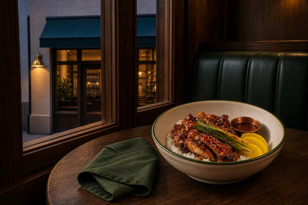
Image prompt — truthful food-photo enhancement
Use case: compositing
Asset type: 3:2 landscape instructional blog illustration showing a truthful restaurant food-photo enhancement
Input images: Image 1 contains two identity references: left is the exact restaurant exterior; right is the exact signature dish. Preserve both faithfully.
Primary request: Create a refined promotional food photograph that places the unchanged signature dish from the right panel of Image 1 on a walnut table beside the recognizable restaurant window and forest-green banquette from the left panel. Improve lighting, crop, background separation, and table styling only; do not redesign or enlarge the food.
Scene/backdrop: inside the same restaurant at blue hour, with the walnut-framed front window softly showing the cream facade, forest-green awning, and warm brass wall lamp beyond. Add only a folded dark-green linen napkin and the same small copper sauce cup.
Subject: exactly the same wide off-white handmade bowl with thin forest-green rim; same quantity and shape of mahogany-red glazed grilled chicken, same rice, charred scallions, sesame, exactly three yellow pickled radish slices, same copper sauce cup.
Style/medium: photorealistic premium food editorial photograph, credible enough to represent the menu served.
Composition/framing: 3:2 landscape, dish fully visible in the right-lower third at a 35-degree angle; storefront cues softly recognizable on the left background; generous clean upper-left negative space for later poster copy; no cropping of bowl.
Lighting/mood: soft directional window light from left, warm practical glow from the brass lamp, subtle cool blue-hour rim, natural steam only, appetizing but honest.
Color palette: walnut, cream, forest green, brass, mahogany red, warm rice white.
Materials/textures: moist glaze without plastic shine, separate rice grains, charred scallion texture, matte handmade ceramic, natural wood.
Constraints: preserve exact menu identity, portion, bowl, garnish count, and restaurant architecture from Image 1; change only composition, lighting integration, minor background cleanup, and styling; no people; no text; no logos; no watermark; no invented ingredients; no oversized portion.
Avoid: food replacement, exaggerated cheese or steam, floating garnish, excessive saturation, fake shallow depth, deformed bowl, altered storefront, duplicated dish, misleading abundance.
Compare source and result side by side: bowl silhouette, chicken pieces, rice volume, pickles, sauce, windows, and awning. If an identity-defining feature changes, composite the source element back or reject the output.
4. Compare food-first, place-first, and event-first layouts
Create structurally different concepts instead of applying three filters. Food-first works for a launch, place-first for opening or ambience, and event-first for a limited promotion. Firefly composition reference uses outline and depth to guide arrangement, with strength controlling adherence.
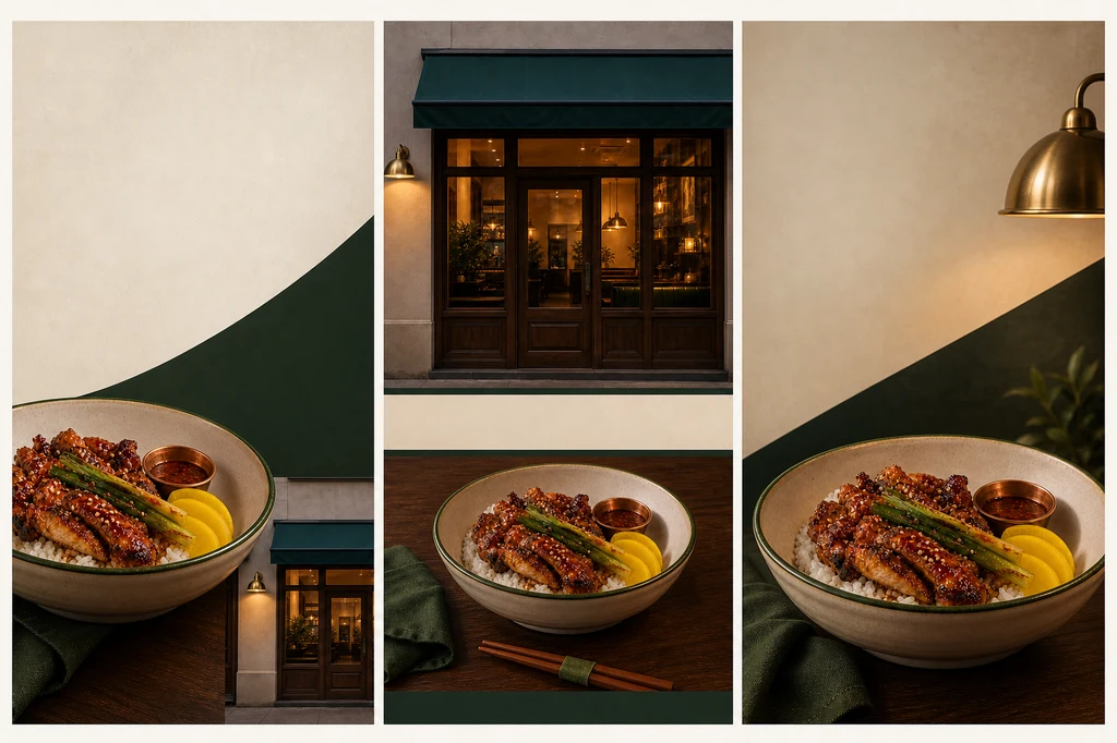
Image prompt — three poster layouts
Use case: ads-marketing
Asset type: 3:2 landscape instructional blog illustration comparing three restaurant-poster layout systems
Input images: Image 1 is the exact source-photo identity board for the restaurant and signature dish. Image 2 is the approved enhanced food photograph and campaign lighting reference. Preserve the exact facade, interior palette, bowl, food portion, garnishes, and copper sauce cup.
Primary request: Create a single sophisticated presentation board containing three clearly separated vertical restaurant-poster concept panels side by side. Each panel uses the same exact restaurant and signature dish but demonstrates a meaningfully different hierarchy. Do not generate any text.
Panel 1 — food-first: large bowl in lower-left, clean cream-and-dark-green negative space upper-right for a headline and offer, small storefront detail at bottom-right.
Panel 2 — place-first: recognizable storefront fills upper half, signature bowl on walnut table in lower half, calm centered composition with reserved empty bands for future name and location.
Panel 3 — event-first: dynamic cropped food hero on right-lower third, warm brass lamp and forest-green diagonal shapes guide the eye, broad empty upper-left zone for a limited-time message and CTA.
Style/medium: photorealistic restaurant campaign concepts presented as a premium art-direction contact sheet.
Composition/framing: 3:2 overall; three equal vertical panels with narrow cream gutters, consistent safe margins and balanced visual scale.
Lighting/mood: coherent warm restaurant glow, soft blue-hour accent, appetizing but natural food highlights.
Color palette: walnut brown, cream, forest green, brass, mahogany red, warm white.
Materials/textures: faithful food texture, handmade ceramic, wood grain, cream plaster, green fabric, brushed brass.
Constraints: exact restaurant and dish identity from references; exactly one dish per panel; no portion inflation; no changed ingredients; no readable text; no placeholder letters; no numbers; no logo; no watermark; no people; each panel visually distinct but campaign-consistent.
Avoid: fake typography, mismatched storefront, distorted bowl, excessive food crop, oversaturation, clutter, generic template UI, duplicated dishes inside a panel.
Reduce every option to phone-thumbnail size. The dish and future headline zone should register within two seconds. If decoration collides with copy, adjust crop or background planes rather than inventing more scene content.
5. Typeset factual copy in a layout tool
Ask the image model for blank zones, then add the exact restaurant name, dish name, price, start/end date, hours, address, reservation or ordering method as editable text. Use no more than two type families, one alignment axis, and one accent color.
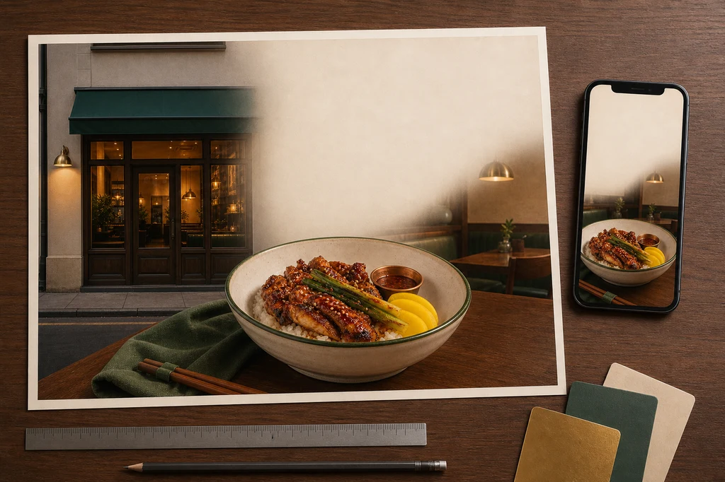
Image prompt — print and mobile proof
Use case: product-mockup
Asset type: 3:2 landscape instructional blog illustration showing final restaurant-poster proofing across print and mobile
Input images: Image 1 is the approved restaurant campaign key visual and exact signature dish. Image 2 is the source-photo identity board for the exact storefront and food. Preserve both faithfully.
Primary request: Create a photorealistic designer's proofing desk that displays one finished landscape restaurant-poster print and one upright smartphone-sized blank-frame mockup using the same approved campaign image. Both show the exact signature dish and recognizable storefront visual but intentionally leave clean empty zones where real restaurant name, price, hours, location, and CTA will later be typeset.
Scene/backdrop: tidy walnut design desk in a softly lit studio, with one large matte poster proof nearly flat, one slim dark smartphone mockup at the right edge, a small fan of cream/forest-green/brass color swatches, a silver ruler, and a pencil. No software UI.
Subject: poster and phone both reproduce the same exact off-white green-rimmed bowl, mahogany glazed chicken, rice, charred scallions, sesame, exactly three yellow pickled radish slices, copper sauce cup, and the same cream/walnut/green/brass restaurant cues.
Style/medium: high-end photorealistic print-production and campaign-consistency mockup.
Composition/framing: 3:2 landscape; poster occupies most of the frame and is fully visible within safe margins; phone is secondary and does not cover the print; accessories stay at edges. Clear blank headline, details, and CTA zones.
Lighting/mood: neutral color-accurate overhead proofing light, warm ambient spill, soft paper and device shadows, professional calm mood.
Color palette: walnut, cream, forest green, brass, mahogany red, warm white.
Materials/textures: matte premium paper, realistic food print detail, brushed metal ruler, cardstock swatches, dark glass phone surface.
Constraints: preserve exact dish, portion, bowl, garnish, storefront and palette from references; one print and one phone only; no readable text; no letters; no numbers; no logo; no watermark; no hands; no people; no fake app UI; no changed ingredients.
Avoid: warped paper hiding the image, glossy glare, duplicate bowls within one layout, fake typography, cluttered stationery, distorted phone, oversized food, unrelated branding.| Channel | Check first | Common failure |
|---|---|---|
| In-store poster | physical size, bleed, distance | tiny price, too much copy |
| Social feed | 1:1 and 4:5 safe area | hero dish cropped |
| Story/Reels | 9:16 UI zones | CTA behind interface |
| Maps/profile | reality-representing photo | excessive AI treatment |
Troubleshooting
| Symptom | Cause | Fix order |
|---|---|---|
| Portion or ingredients changed | weak invariants | reattach source → enumerate locks |
| Food looks plastic | excess gloss/saturation | highlights → saturation → texture |
| Store looks like another place | facade regenerated | lock architecture → clean background only |
| No room for copy | scene-only prompt | objective → subject placement → empty zone |
| Price or hours wrong | text delegated to image model | remove text → typeset in layout tool |
| Mobile crop fails | one ratio only | channel crops and safe areas |
Pre-publish checklist
- Portion, ingredients, bowl, and garnish match the item served.
- Exterior, seating, and atmosphere accurately represent the place guests visit.
- A person verified the name, price, dates, hours, address, and CTA.
- Discounts, origin, quality, and health claims have appropriate support.
- Photo, logo, and font rights and current platform policies were checked.
- Core content stays inside print, feed, and vertical safe areas.
- No fake text, logo, or watermark remains in generated imagery.
Conclusion
The best AI restaurant poster does not invent a more impressive restaurant. It edits the appeal of the real place and menu into a clearer message. Honest source photography, constrained AI changes, meaningful layout variants, and human-verified typesetting protect both style and trust.
Sources
- Google Business Profile — Tips for business-specific photos
- Google Business Profile — Get started for restaurants
- OpenAI — Image generation guide
- Google AI — Image generation and editing
- Adobe Firefly — Match image composition to a reference
- Adobe Firefly — Style reference image
Capabilities and policies change. Check local advertising, food, origin, and price-display rules before publishing a real promotion.