
A lopsided cat can stop a scroll more effectively than another flawless cinematic render. Its line shakes, the color escapes the outline, and the perspective is wrong, yet the image feels unusually warm. That is the appeal behind the recent rise of naive design, doodles, and deliberately unfinished visual language.
Canva grouped its 2026 forecast under “Imperfect by Design,” describing a move toward raw texture and human presence instead of algorithmic polish. Adobe Express's July 2026 Naive Design feature similarly highlights wavy lines, bright color, and handmade irregularity. This is not simply a lack of skill. It is a designed visual system in which a capable tool is instructed to preserve awkwardness.
I tested whether asking AI to “draw like an elementary-school student” would be enough. It was not. Instead of claiming a real child made the work or copying a named artist, the experiment specified observable traits across four media: crayon, felt-tip marker, colored pencil, and wrinkled construction paper.
The short verdict
- The model became more convincingly awkward when the prompt named the material and the type of error, not just the subject.
- “Cute drawing” tends to snap back to polished character art. Wobbly lines, mismatched eyes, incorrect perspective, and color outside the outline need separate instructions.
- Too many errors destroy readability. A simple subject and three to five controlled imperfections worked best.
- Describing a naive, childlike visual language is more precise than presenting the output as an actual child's work.
What I evaluated
| Dimension | What I checked | Successful result |
|---|---|---|
| Shape | proportion and symmetry | Awkward but instantly recognizable |
| Line | wobble, overlap, pressure | Resembles hesitation, not a digital filter |
| Color | pressure, gaps, overspill | Material is visible without ruining the scene |
| Space | scale, baseline, perspective | Wrong but narratively readable |
| Personality | unexpected detail | Memorable, not merely low resolution |
Test 1: Crayon cat — specify the mistakes directly
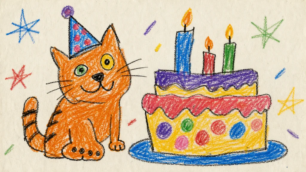
This was the clearest “bad on purpose” result. Mismatched eyes, an oversized paw, blunt crayon grain, and an awkward cat-to-cake scale reinforce one another. Notice that the prompt never relies on low quality. That phrase can produce blur or compression artifacts. Instead, it tells the model exactly where the drawing should be unsophisticated.
Production prompt
Create an original wide 16:9 image that looks like a deliberately clumsy wax-crayon drawing on off-white school drawing paper. Main subject: a lopsided orange cat wearing a crooked paper party hat, sitting beside an oversized birthday cake with three uneven candles. Awkward anatomy, mismatched eyes, paws of different sizes, wobbly black outlines, blunt crayon strokes, patchy coloring that occasionally crosses the lines, flattened perspective, too-large objects, cheerful primary colors, lots of empty paper. It should feel charming and spontaneous, like naive childlike visual language, but must be an original AI-made illustration and not imitate any named artist. No readable words, no signatures, no logos, no watermark, no polished vector edges, no photorealism, no professional anatomy.Test 2: Marker bus — keep structure inside broken perspective
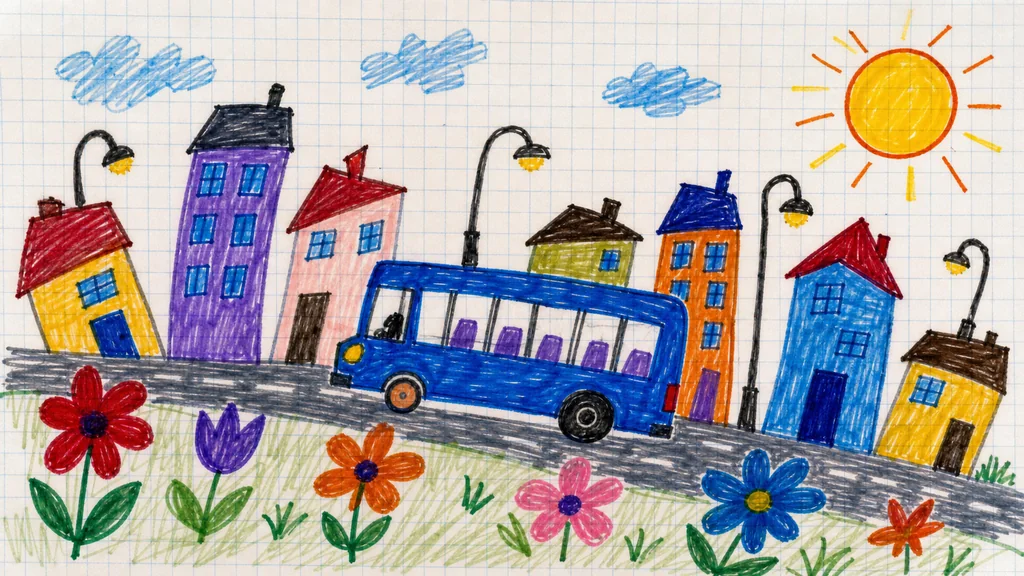
With a more complex background, the model wanted to straighten the architecture and vehicle. The prompt therefore places errors in specific locations: a slanted road, mismatched wheels, and a wandering skyline. Perspective is wrong, but the event—a bus crossing a neighborhood—remains clear. Effective naive design is not random damage; it preserves the hierarchy of information.
Production prompt
Create an original wide 16:9 illustration that looks intentionally amateurish, drawn with cheap felt-tip markers on pale grid notebook paper. A crooked blue city bus travels along a slanted road through a tiny neighborhood of leaning houses, uneven streetlights, oversized flowers, and a round sun in the corner. The bus has mismatched wheels and simplified windows, perspective is charmingly wrong, the skyline baseline wanders, marker fills are streaky with small gaps, colors slightly overlap the outlines. Naive, playful, awkward and human-looking rather than polished. No readable text, no numbers, no logos, no signatures, no watermark, no vector-perfect geometry, no photorealism, no named artist style.Test 3: Pencil dinosaur — cute versus commercially polished
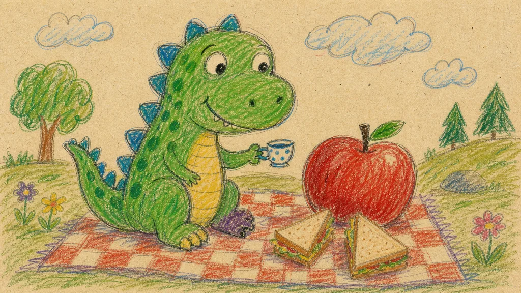
“Cute dinosaur” is exactly the kind of subject an image model tries to turn into polished commercial character art. An oversized head, mismatched feet, hesitant double lines, and patchy pencil pressure helped resist that pull. The face and torso were still cleaner than expected. For a rougher revision, add one targeted change at a time, such as “one arm noticeably shorter” or “visible erase-and-redraw marks.”
Production prompt
Create an original wide 16:9 picture that looks like a deliberately unsophisticated colored-pencil and crayon drawing on warm recycled paper. A friendly green dinosaur with a head slightly too large sits at a picnic blanket, trying to hold a tiny teacup beside an enormous red apple and two triangular sandwiches. Uneven limbs, irregular scales, mismatched feet, hesitant double-drawn outlines, simplified anatomy, flattened perspective, patchy hand pressure, visible pencil grain, some colors outside the lines, a few crooked clouds. Cute, awkward, funny, and sincere; deliberately naive rather than polished. No readable text, no signatures, no logos, no watermark, no photorealism, no clean vector styling, no named artist imitation.Test 4: Astronaut — make the paper part of the scene
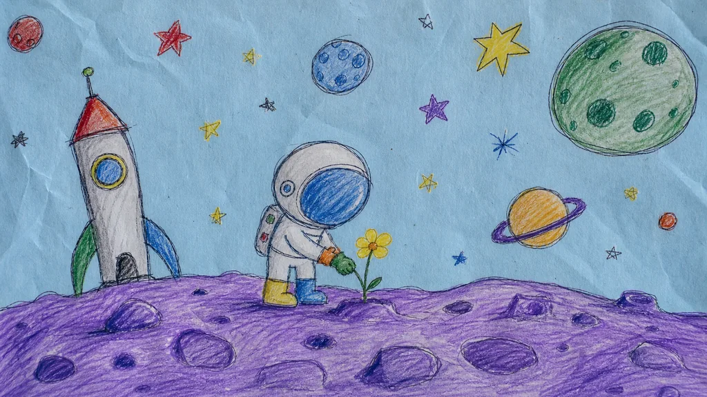
The final test changes the substrate as well as the style. Wrinkled blue construction paper, blunt pencils, and a wandering horizon communicate analogue imperfection before the subject does. The suit and rocket remain surprisingly coherent. Adding paper texture, uneven pressure, erased marks, and doubled outlines often produces a more human impression without sacrificing readability.
Production prompt
Create an original wide 16:9 naive drawing on slightly wrinkled pale blue construction paper, made with blunt colored pencils and a few wax crayons. A tiny astronaut with an oversized round helmet stands on a bumpy purple moon and carefully plants one small yellow flower. Include a crooked rocket in the distance, mismatched stars, uneven planets, and a wandering horizon. Simplified body, asymmetrical gloves and boots, shaky double outlines, inconsistent scale, obvious paper texture, sparse childish mark-making, imperfect color fills and funny perspective. Sweet and imaginative, intentionally clumsy and unpolished but visually readable. No readable text, no flag symbols, no logos, no signatures, no watermark, no professional realism, no smooth vector lines, no named artist style.Comparing the four outputs
| Scene | Naive effect | What AI over-polished | Next adjustment |
|---|---|---|---|
| Cat and cake | Very strong | Cake construction | Make the tiers less symmetrical |
| Bus and town | Strong | Vehicle body | Vary window spacing and wheel size |
| Dinosaur picnic | Medium | Face and torso | Add visible redraw marks |
| Moon astronaut | Medium–strong | Suit and rocket | Add one limb-length mismatch |
The crayon cat won the test. Its simple subject, strong material cue, limited palette, and explicit proportion errors do not compete. As the scene became more complex, the model returned to orderly illustration, while piling on more mistakes risked turning controlled awkwardness into noise.
The prompt formula that worked
Simple subject + clear action + physical medium and paper + 3–5 controlled mistakes + required readability + exclusions
Break “a badly drawn cat” into six decisions:
- Subject: orange cat in a party hat beside a cake
- Medium: blunt wax crayon on off-white drawing paper
- Shape errors: mismatched eyes, large paw, flat perspective
- Line and color: wobbly outline, patchy fill, slight overspill
- Preserve: cat and cake remain instantly recognizable
- Exclude: smooth vector work, professional anatomy, logos, signatures, named-artist imitation
OpenAI's image prompting guide recommends clear instructions about purpose, subject, action, setting, style, composition, and material, followed by small targeted revisions. The same method works here. The difference is that the specification defines which imperfections must survive rather than asking the model to maximize polish.
Where this look works—and where it does not
It fits friendly social cards, event teasers, independent publishing, sticker concepts, note-like content, and approachable illustrations for technical topics. Use more care in medical or safety instructions, precise product explanations, or campaigns that could be mistaken for work actually created by children. Disclose AI authorship where relevant and do not market the output as a real child's drawing or a particular artist's style.
Conclusion
Making AI draw badly was harder than expected. Image models naturally correct proportions, clean lines, and converge on attractive composition. But when a prompt identifies which mistakes to preserve across medium, line, proportion, color, and perspective, it can reduce the familiar synthetic polish and produce a charming naive image.
The goal is not genuine incompetence. It is editing awkwardness while preserving recognition. Once imperfection becomes an art direction, a “bad drawing” stops being a failure and becomes a design choice.
Sources checked
- Canva Design Trends 2026 — Imperfect by Design
- Canva — From polish to presence
- Adobe Express — Naive Design microtrend
- OpenAI Academy — Creating images with ChatGPT
All five visuals were newly generated by AIZIGOO as original AI images. They are not real children's artwork and do not imitate a named artist. Trend interpretation and product guidance were checked on 2026-07-29.