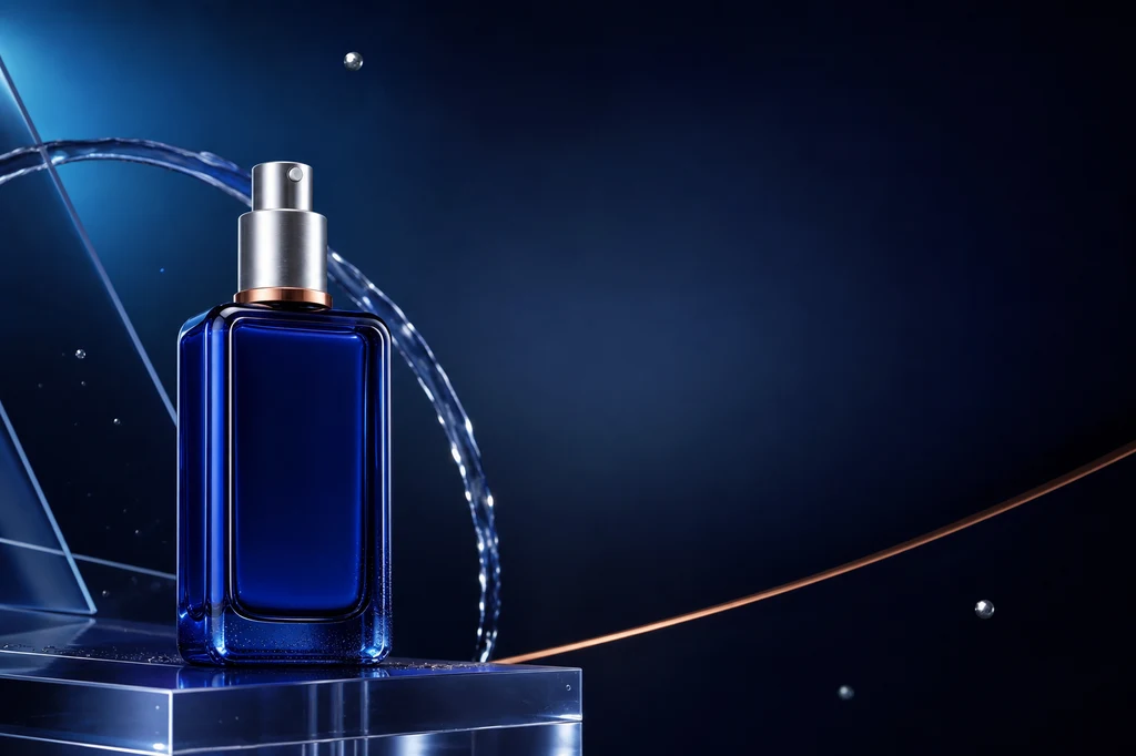
AI広告チラシで最も深刻な失敗は、背景が平凡なことではなく 実際の商品と違う画像になること です。容器の比率、キャップ、ラベル、色、素材が変われば、美しくても商品広告には使えません。価格、容量、法的表示まで画像モデルに任せると重要な誤字も起こり得ます。
本ガイドでは商品参照を固定し、背景と構図を生成し、正確なコピーはCanva、Adobe Express、Figmaなどで編集可能な文字として追加します。OpenAIは画像入力を使う反復編集を提供し、Googleの製品カスタマイズ資料は参照商品を別の場面へ配置する用途を説明しています。Adobe Fireflyでは構図参照とスタイル参照を分けて制御できます。
制作フロー
| 段階 | 成果物 | AIの役割 | 人の確認 |
|---|---|---|---|
| 1. 商品基準 | きれいな物撮り | 背景整理・光補正 | 形状・ラベル・色 |
| 2. 情報設計 | 見出し・利点・CTA | コピー案 | 主張・価格・表現 |
| 3. 広告シーン | 合成画像 | 環境・光・素材 | 輪郭・影・同一性 |
| 4. レイアウト | 3案 | 視線誘導・余白 | 優先順位・可読性 |
| 5. 組版・出力 | 最終チラシ | 必要箇所の画像修正 | 正確な文字・出力仕様 |
例は特定ブランドを模倣しないコバルトブルーのガラス製セラムボトルです。実務では商品写真、ロゴ、コピー、背景参照に必要な権利を先に確認してください。
カバー画像制作プロンプト
Use case: ads-marketing
Asset type: landscape blog cover and finished advertising-flyer example
Primary request: Create a polished, premium advertising flyer composition for an original unbranded skincare serum product.
Scene/backdrop: deep midnight-navy studio environment with a soft cyan-to-indigo radial glow, translucent acrylic planes, a delicate arc of clear water, a few restrained floating silver particles, and a refined copper accent line.
Subject: one distinctive cobalt-blue rectangular glass serum bottle with softly rounded shoulders, a brushed-silver cylindrical pump cap, a thin copper collar ring, and no label or logo. The exact bottle design must be clear and memorable for use in later reference images.
Style/medium: photorealistic luxury product photography combined with sophisticated editorial graphic design.
Composition/framing: 3:2 landscape. Place the bottle prominently in the left third on a low translucent acrylic plinth. Preserve generous clean negative space across the upper-right and center-right for a future headline, plus a smaller quiet area at the lower-right for future price and call-to-action copy. Strong diagonal visual flow without clutter.
Lighting/mood: controlled studio key light from upper left, cool cyan rim light, subtle warm copper reflection, crisp glass edges, premium and calm rather than flashy.
Color palette: midnight navy, cobalt blue, icy cyan, brushed silver, restrained copper.
Materials/textures: realistic thick blue glass, fine condensation only near the bottle base, polished acrylic, controlled soft shadows and reflections.
Constraints: original product design; no people; no readable text; no letters; no numbers; no logos; no trademarked packaging; no watermark; no mockup frame; no UI; no gibberish typography. Keep all important objects inside safe margins and make the negative space intentional.
Avoid: duplicated bottles, malformed pump, excessive water splash, busy particles, cheap neon cyberpunk, illegible labels, overexposure.
1. 商品写真を制作の基準にする
商品全体が見え、輪郭と反射を確認できる解像度を使います。半透明容器と金属キャップは周囲の色を拾うため、中立背景と広い拡散光が有効です。「同一の商品を維持し、再設計しない」と明記します。
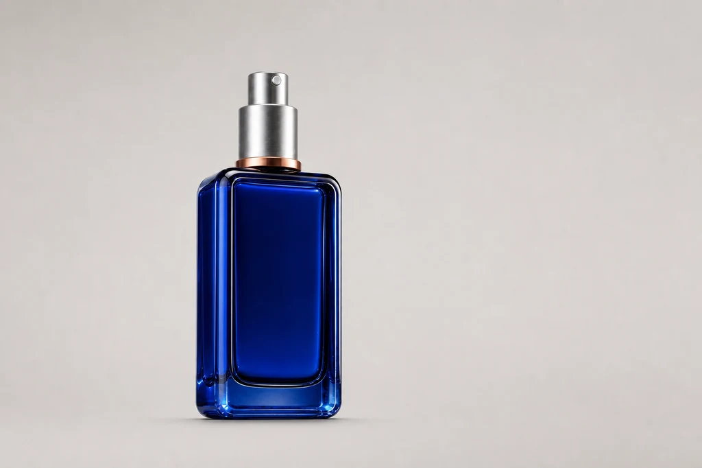
画像制作プロンプト — 基準商品カット
Use case: product-mockup
Asset type: instructional blog illustration showing the clean source product photograph
Input images: Image 1 is the identity reference for the exact product. Preserve the same cobalt-blue rectangular glass bottle, softly rounded shoulders, thick clear-blue glass edges, brushed-silver cylindrical pump cap, thin copper collar ring, proportions, and unbranded front.
Primary request: Create a clean professional source packshot that could be used as the starting product image for an AI advertising-flyer workflow.
Scene/backdrop: seamless pale warm-gray studio cyclorama with no horizon seam.
Subject: exactly one identical bottle from Image 1, standing upright, centered slightly left, front three-quarter angle, fully visible with generous padding.
Style/medium: photorealistic commercial catalog product photography.
Composition/framing: 3:2 landscape; product occupies about 42 percent of frame height; broad empty space around it for easy selection and masking.
Lighting/mood: large diffused softbox from upper left, gentle fill from right, controlled specular edge highlights, realistic soft contact shadow directly beneath.
Color palette: neutral warm gray, cobalt blue, silver, copper.
Materials/textures: preserve thick blue glass and brushed metal with crisp realistic edges; clean surface with no dust.
Constraints: preserve the exact product identity from Image 1; no redesign; no additional products; no props; no text; no label; no logo; no watermark; no colored background spill; no clipping.
Avoid: dramatic ad background, water, floating particles, hard shadows, distorted pump, duplicate bottle, reflections that obscure the silhouette.
実在ラベルは綴り、ロゴ比率、容量、認証マーク、バーコードを拡大比較します。ずれた生成ラベルは使わず、元ラベルをマスクで戻すか承認済みの別レイヤーで再構築します。
2. デザイン前に目的と情報階層を決める
「おしゃれに」ではなく、新商品認知、来店、期間限定購入など目的を一つにします。見出し、主要便益、根拠、価格・期間、CTAの順に設計します。生成画像には文章ではなく、それらを置く 空白領域 を要求します。
| 情報層 | 役割 | 実務ルール |
|---|---|---|
| 見出し | 注目を得る | 最大文字、一つのメッセージ |
| 主要便益 | 必要性を説明 | 1〜2点に限定 |
| 根拠 | 主張を支える | 検証済み表現のみ |
| 価格・期間 | 判断情報 | 単位と日付を再確認 |
| CTA | 次の行動 | 短い動詞表現 |
3. 商品を固定し、背景・光・接地だけを変える
優れた合成は派手さではなく、商品が実際にその場へ置かれたように見えることです。基準画像を商品参照にし、環境、位置、統合照明だけを変更します。キャップ、容器比率、色、正面方向は維持し、背景物は輪郭の後ろか下に置きます。
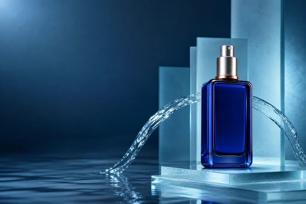
画像制作プロンプト — 商品保持合成
Use case: compositing
Asset type: instructional blog illustration showing subject-preserving background generation for a product ad
Input images: Image 1 is the exact product reference and identity anchor.
Primary request: Place the unchanged cobalt-blue serum bottle from Image 1 into a premium aquatic advertising scene while preserving every product-defining feature.
Scene/backdrop: sculptural pale-cyan frosted glass slabs, a shallow mirror-like water surface, one elegant controlled water ribbon curving behind the product, subtle soft haze, and a dark navy-to-teal gradient distance.
Subject: exactly one identical bottle from Image 1 with the same rectangular proportions, rounded shoulders, thick cobalt glass, brushed-silver pump cap, copper collar ring, unbranded front, and front three-quarter orientation.
Style/medium: photorealistic luxury skincare campaign photography.
Composition/framing: 3:2 landscape. Product on the right third, fully visible and grounded on a low frosted-glass step. Preserve a broad quiet negative-space field on the left for future headline and benefit copy. Keep water and props behind or below the product silhouette.
Lighting/mood: cool cyan rim light matched to the bottle, soft white key light from upper left, subtle copper bounce near the collar, controlled reflection and soft grounded shadow.
Color palette: deep navy, pale cyan, cobalt, silver, restrained copper.
Materials/textures: precise glass refraction, brushed metal, clean water, frosted acrylic.
Constraints: preserve product identity and geometry from Image 1; change only environment, lighting integration, and placement; no label; no text; no letters; no numbers; no logo; no watermark; no people; no duplicate product; intentional copy space.
Avoid: liquid covering the bottle, fantasy deformation, excessive splash, crowded props, cheap neon, floating product, altered cap or collar.
商品が浮いて見える場合は床面と接触影を指定し、ガラス縁の色が環境と合わない場合はリムライトを調整します。水、煙、装飾が商品を横切る構図は避けます。
4. 本当に異なる三つの構図を比較する
位置を少し変えただけの案ではなく、情報構造が異なる案を作ります。ミニマル型は広いコピー領域、中央型は商品集中、対角線型は動きが利点です。色、光、素材の規則を共通化すると一つのキャンペーンになります。
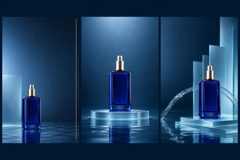
画像制作プロンプト — 三つのレイアウト案
Use case: ads-marketing
Asset type: instructional blog illustration comparing three advertising-flyer layout directions
Input images: Image 1 is the exact product identity reference. Image 2 is the approved aquatic campaign palette and material reference.
Primary request: Create a single sophisticated landscape presentation board containing three clearly separated vertical flyer concept panels side by side, all using the exact same cobalt-blue serum bottle. Demonstrate three useful layout systems without adding any text.
Panel 1: minimal editorial composition, bottle low-left, broad clean upper-right copy space, one thin copper rule.
Panel 2: centered symmetric hero composition, bottle centered on a translucent circular plinth, generous quiet space above and below for copy.
Panel 3: dynamic diagonal composition, bottle right-lower third, controlled water ribbon and frosted planes leading from left to right, clean upper-left copy space.
Style/medium: photorealistic luxury product campaign concepts displayed as a high-end art-direction contact sheet.
Composition/framing: 3:2 landscape overall, three equal panels with narrow clean navy gutters, consistent safe margins and visual scale.
Lighting/mood: coherent cool cyan studio light, subtle copper highlight, premium and restrained.
Color palette: midnight navy, cobalt, pale cyan, brushed silver, copper.
Materials/textures: thick blue glass, brushed metal, frosted acrylic, controlled water reflection.
Constraints: preserve the exact product design from Image 1 in all three panels; exactly one bottle per panel; no labels; no readable text; no placeholder letters; no numbers; no logos; no watermark; no decorative UI; panels must be visually distinct yet brand-consistent.
Avoid: duplicated bottle within a panel, distorted pump, inconsistent bottle color, excessive splash, clutter, tiny illegible type, random symbols.
小さなサムネイルで商品が最初に見えるか、装飾がコピーと衝突しないか、モバイル切り抜きでも主役が残るか確認します。
5. 正確なコピーを組版し、出力を検査する
承認済み背景を固定し、見出し、便益、価格、CTAを編集可能なベクター文字で追加します。書体は2種類以下、整列軸は一つ、強調色は商品の補助色から選びます。価格、割引、日付、効能表現、法的表示を元データと照合します。
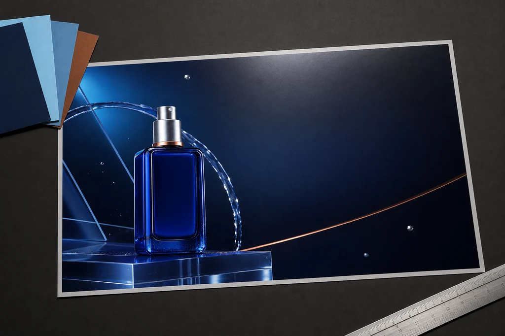
画像制作プロンプト — 印刷校正モックアップ
Use case: product-mockup
Asset type: instructional blog illustration showing final advertising-flyer production and print-quality review
Input images: Image 1 is the approved final campaign artwork and layout reference. Image 2 is the exact product identity anchor.
Primary request: Create a photorealistic art-director desk scene displaying a finished landscape advertising flyer for the same cobalt-blue serum bottle, ready for final typography to be added in a design application.
Scene/backdrop: refined dark-charcoal creative studio desk with one large landscape flyer print lying nearly flat at a slight perspective angle, a small fan of three navy/cyan/copper color swatches, a silver precision ruler, and one soft proofing light reflection.
Subject: the printed flyer prominently reproduces the exact bottle and the approved midnight-navy campaign artwork from Image 1. The flyer preserves an elegant empty headline area on the right and a smaller empty offer/CTA zone below it.
Style/medium: high-end photorealistic print-production mockup, restrained editorial art direction.
Composition/framing: 3:2 landscape. Flyer occupies most of the frame and remains fully visible inside safe margins. Accessories stay at the edges and never cover the product or copy zones.
Lighting/mood: neutral color-accurate overhead proofing light, soft shadow beneath paper, subtle cyan reflections, premium professional mood.
Color palette: charcoal, midnight navy, cobalt blue, pale cyan, brushed silver, restrained copper.
Materials/textures: matte premium paper with crisp print detail, metal ruler, cardstock swatches, realistic but clean desk texture.
Constraints: preserve the exact product design from Image 2 and campaign arrangement from Image 1; one flyer only; no readable text; no letters; no numbers; no logos; no watermark; no hands or people; no computer UI; no extra bottles outside the printed artwork.
Avoid: curled paper obscuring artwork, illegible fake typography, cluttered stationery, multiple flyers, warped bottle, glossy glare hiding the design, brand names.
印刷では用紙サイズ、塗り足し、安全域、色、PDF仕様を印刷会社に合わせます。デジタル配置は比率ごとに別出力し、実際のスマートフォンサイズでCTAを確認します。
トラブルシューティング
| 兆候 | 原因 | 修正順序 |
|---|---|---|
| ボトルやキャップが変わる | 参照制約が弱い | 基準を再添付 → 不変条件を記述 |
| 商品が浮く | 影・反射の不一致 | 床面 → 影 → リムライト |
| コピー場所がない | シーンのみ指定 | 商品位置 → 空白 → 安全域 |
| 安っぽく見える | 色・素材が多すぎる | 主色2色+アクセント1色 |
| 価格・文章が誤る | 文字を画像生成へ委任 | 文字を削除 → デザインツールで組版 |
| 印刷が暗い | 画面だけで補正 | プロファイル・校正紙を確認 |
公開前チェック
- 商品写真とブランド素材の利用権を確認した。
- 形状、ラベル、色、素材、付属品が実物と一致する。
- 効能、価格、割引、期間、法的表示を人が検証した。
- 見出し、便益、価格、CTAの優先順位が明確である。
- 偽文字、不要なロゴ、ウォーターマークが残っていない。
- モバイル、Web、印刷の安全域と実寸可読性を確認した。
- 最新のプラットフォーム規約と商用条件を確認した。
まとめ
洗練されたAIチラシは万能プロンプトではなく、信頼できる商品写真、情報階層、商品を維持する合成、意味のある構図比較、正確な組版、出力検査の連鎖から生まれます。AIは場面と雰囲気の探索に強く、人は商品事実とコピーの正確性に責任を持ちます。
参考資料
- OpenAI — Image generation guide
- Google Cloud — Subject customization for product images
- Adobe Firefly — Match image composition to a reference
- Adobe Firefly — Style reference images
生成機能とポリシーは変わる可能性があります。実際の商品広告では表示、知的財産、業種別規制も別途確認してください。